A friendly tutorial for crafting slightly prettier websites
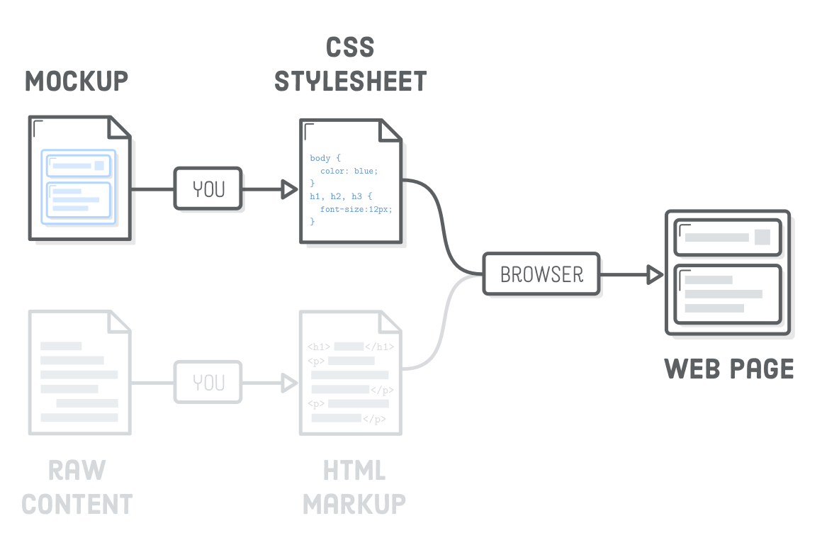
The first few chapters of this tutorial focused exclusively on HTML. Now, it’s time to make things pretty (sort of) with Cascading Style Sheets (CSS). You can think of CSS as defining the “design” of a web page. It determines things like font size, margins, and colors using a language entirely separate from HTML.
Why is it a separate language? Well, it serves a completely different purpose. HTML represents the content of your web page, while CSS defines how that content is presented to the user. This is a fundamental distinction central to modern web development.
CSS provides the vocabulary to tell a web browser things like, “I want my headings to be really big and my sidebar to appear on the left of the main article.” HTML doesn’t have the terminology to make those kinds of layout decisions—all it can say is, “that’s a heading and that’s a sidebar.”
In this chapter, we’ll explore the basic syntax of CSS, as well as how to connect it to our HTML documents. The goal isn’t so much to become a CSS expert or memorize all the available styles, but rather to understand how CSS and HTML interact. CSS typically lives in its own file, so as in the previous chapter, good file organization will be paramount.
Setup
To keep things simple, we’ll store the example for each chapter of this tutorial in a separate folder. Using Atom, create a new project called hello-css. We’re going to be styling an existing page called hello-css.html, so go ahead and create that, then add the following markup:
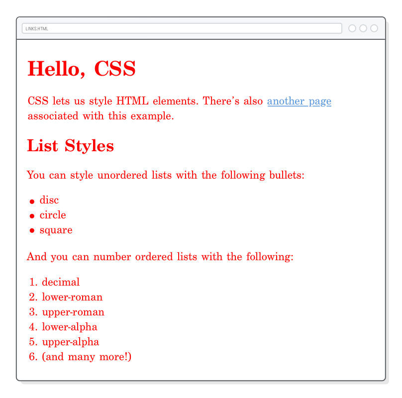
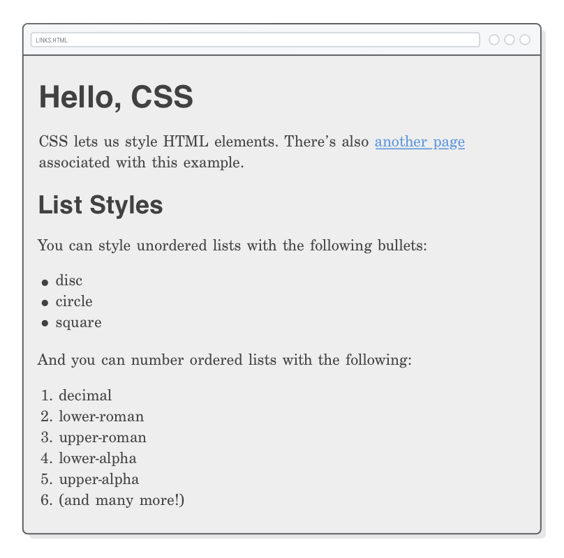
<!DOCTYPE html><htmllang='en'><head><metacharset='UTF-8'/><title>Hello, CSS</title></head><body><h1>Hello, CSS</h1><p>CSS lets us style HTML elements. There’s also
<ahref='dummy.html'>another page</a> associated with this example.</p><h2>List Styles</h2><p>You can style unordered lists with the following bullets:</p><ul><li>disc</li><li>circle</li><li>square</li></ul><p>And you can number ordered lists with the following:</p><ol><li>decimal</li><li>lower-roman</li><li>upper-roman</li><li>lower-alpha</li><li>upper-alpha</li><li>(and many more!)</li></ol></body></html>
In addition, we’ll need a small dummy page to learn how CSS styles can be applied to multiple web pages. Create dummy.html and add the following:
<!DOCTYPE html><htmllang='en'><head><metacharset='UTF-8'/><title>Dummy</title></head><body><h1>Dummy</h1><p>This is a dummy page that helps us demonstrate reusable CSS
stylesheets. <ahref='hello-css.html'>Go back</a>.</p><p>Want to try crossing out an <ahref='nowhere.html'>obsolete link</a>? This
is your chance!</p></body></html>
CSS Stylesheets
CSS stylesheets reside in plaintext files with a .css extension. Create a new file called styles.css in our hello-css folder. This will house all our example snippets for this chapter. Let’s add one CSS rule so that we can tell if our stylesheet is hooked up to our HTML pages properly.
body {
  color: #FF0000;
}
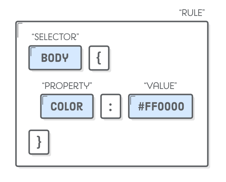
A CSS “rule” always start with a “selector” that defines which HTML elements it applies to. In this case, we’re trying to style the <body> element. After the selector, we have the “declarations block” inside of some curly braces. Any “properties” we set in here will affect the <body> element.
color is a built-in property defined by the CSS specification that determines the text color of whatever HTML elements have been selected. It accepts a hexadecimal value representing a color. #FF0000 means bright red.
CSS properties are kind of like HTML attributes in that they both deal with key-value pairs. Except, here we’re defining presentational information instead of contributing to the semantic meaning of the underlying content.
Linking a CSS Stylesheet
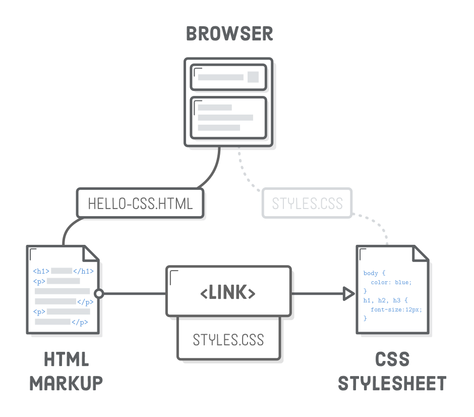
If you try loading either of the HTML pages in a browser, you won’t see our stylesheet in action. That’s because we didn’t link them together yet. This is what the HTML <link/> element is for. In hello-css.html, change <head> to the following:
This <link/> element is how browsers know they need to load styles.css when they try to render our hello-css.html page. We should now see blindingly red text everywhere:
The <link/> element is just like the <a> element, but it’s only meant to be used inside of <head>. Since it’s in the head of the document, <link/> connects to metadata that’s defined outside of the current document. Also notice that it’s an empty element, so it doesn’t need a closing tag.
The rel attribute defines the relationship between the resource and the HTML document. By far the most common value is stylesheet, but there are a few other options. The href attribute works the same as in the previous chapter, only it should point to a .css file instead of another web page. The value for href can be an absolute, relative, or root-relative link.
Note that there’s no direct connection between the browser and our stylesheet. It’s only through the HTML markup that the browser can find it. CSS, images, and even JavaScript all rely on an HTML page to glue everything together, making HTML the heart of most websites.
CSS Comments
Now that our stylesheet is hooked up, let’s play with it a little bit. That red is horrible. Let’s tone it down to a nice gray:
body {
  color: #414141;    /* Dark gray */
}
Notice that comments in CSS are a little different than their HTML counterparts. Instead of the <!-- --> syntax, CSS ignores everything between /* and */ characters.
Setting Multiple Properties
You can stick as many properties as you want in the declarations block of a CSS rule. Try setting the background color of the entire web page by changing our rule to the following:
body {
color: #414141; /* Dark gray */background-color: #EEEEEE; /* Light gray */
}
The background-color property is very similar to the color property, but it defines the background color of whatever element you selected. Take a second to admire those semicolons at the end of each declaration. Removing them will break the CSS rule, so always mind your semicolons!
Why did we pick shades of grays instead of black and white? Using a #000000 background with a #FFFFFF text color is too high of a contrast. It makes it look like the page is vibrating, which can be very distracting for readers.
Selecting Different Elements
Of course, you’ll want to apply styles to elements other than <body>. For that, simply add more CSS rules with different selectors. We can change the font size of our <h1> headings like so:
body {
color: #414141; /* Dark gray */background-color: #EEEEEE; /* Light gray */
}
h1 {
font-size: 36px;
}
And, if you want to alter h2 headings, add another rule:
h2 {
  font-size: 28px;
}
Units of Measurement
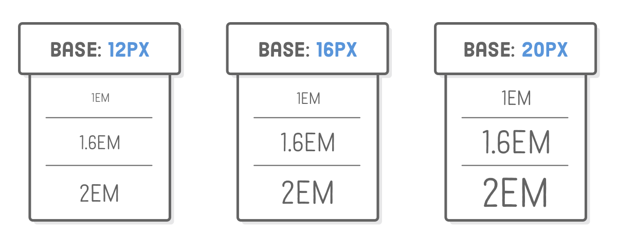
Many CSS properties require a unit of measurement. There’s a lot of units available, but the most common ones you’ll encounter are px (pixel) and em (pronounced like the letter m). The former is what you would intuitively call a pixel, regardless of whether the user has a retina display or not, and the latter is the current font size of the element in question.
The em unit is very useful for defining sizes relative to some base font. In the above diagram, you can see em units scaling to match a base font size of 12px, 16px, and 20px. For a concrete example, consider the following alternative to the previous code snippet:
This sets our base font size for the document to 18px, then says that our <h1> elements should be twice that size and our <h2>’s should be 1.6 times bigger. If we (or the user) ever wanted to make the base font bigger or smaller, em units would allow our entire page to scale accordingly.
Selecting Multiple Elements
What if we want to add some styles to all our headings? We don’t want to have redundant rules, since that would eventually become a nightmare to maintain:
This defines the font to use for all of our headings with a single rule. That’s great, ’cause if we ever want to change it, we only have to do so in one place. Copying and pasting code is usually a bad idea for web developers, and multiple selectors can help reduce that kind of behavior quite a bit.
Defining Fonts
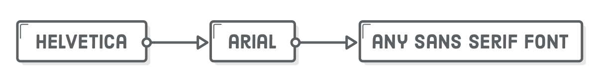
font-family is another built-in CSS property that defines the typeface for whatever element you selected. It accepts multiple values because not all users will have the same fonts installed. With the above snippet, the browser tries to load the left-most one first (Helvetica), falls back to Arial if the user doesn’t have it, and finally chooses the system’s default sans serif font.
Relying on the user’s built-in fonts has historically been incredibly limiting for web designers. Nowadays, system fonts have been largely superseded by web fonts. You can read more about this in the Web Typography chapter of this tutorial.
List Styles
The list-style-type property lets you alter the bullet icon used for <li> elements. You’ll typically want to define it on the parent <ul> or <ol> element:
ul {
  list-style-type: circle;
}

ol {
  list-style-type: lower-roman;
}
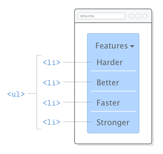
You can find other common values in the hello-css.html example page. Of particular interest is none, which is commonly used when marking up menu navigation with a <ul> list. The none value allows the menu’s list items to be styled more like buttons. In the Advanced Positioning chapter, we’ll actually use this technique to create the navigation menu shown below.
This is good example of the separation of content from presentation. A navigation menu is an unordered list, but it also makes sense to display them as buttons instead of a typical bulleted list. Intelligently designed HTML allows search engines to infer the structure of our content, while CSS lets us display it to humans in beautiful ways.
You can even create custom bullets for <li> elements with the list-style-image property (see MDN for details).
Defining the color of your text and the appearance of your bullets might seem trivial, and it kind of is. But, look at the bigger picture: this is about gaining complete control over the appearance of an HTML document. Alone, a single CSS property is silly. Put them all together, and you’re able to create a totally customized web page.
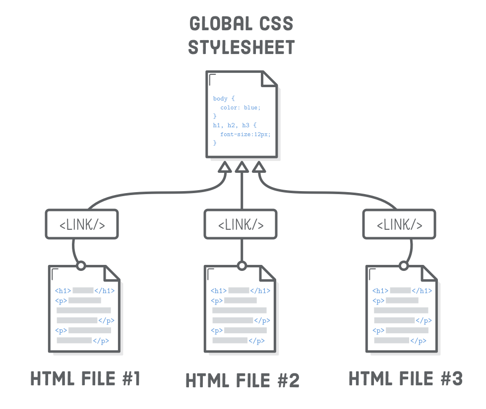
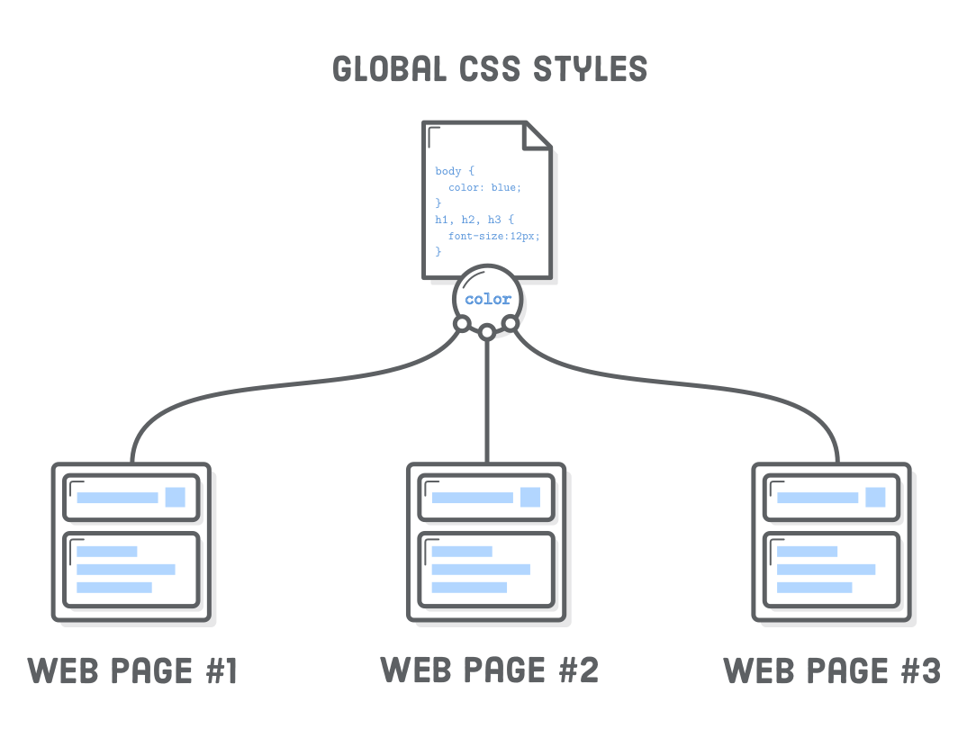
Reusable Stylesheets
So, we just defined some basic styles for one of our web pages. It would be really convenient if we could reuse them on our other page, too. For this, all we need to do is add the same <link/> element to any other pages we want to style. Try adding the following line to the <head> of dummy.html:
<linkrel='stylesheet'href='styles.css'/>
Now, our dummy.html pages should match our hello-css.html styles. Whenever we change a style in styles.css, those changes will automatically be reflected in both of our web pages. This is how you get a consistent look and feel across an entire website.
You’ll almost always have at least one stylesheet that’s applied to the entire site. It’s usually a good idea to use root-relative paths when linking global stylesheets to avoid problems in nested pages. For example, some-folder/page.html would need to use ../styles.css to reference our styles.css file, and this can get real confusing real quick.
More Text Styles
There’s a whole bunch of different CSS properties that we’ll be introducing over the course of this tutorial, but for now, let’s finish up with some of the most common ways to format text.
Underlines
The text-decoration property determines whether text is underlined or not. By setting it to none, we can remove the default underline from all of our links. We’ll discuss link styles in-depth later on.
a {
  text-decoration: none;
}
The other common value for text-decoration is line-through to strike out “deleted” text. But, remember that meaning should always be conveyed through HTML—not CSS. It’s better to use the <ins> and <del> elements instead of adding a line-through style to, say, an ordinary <p> element.
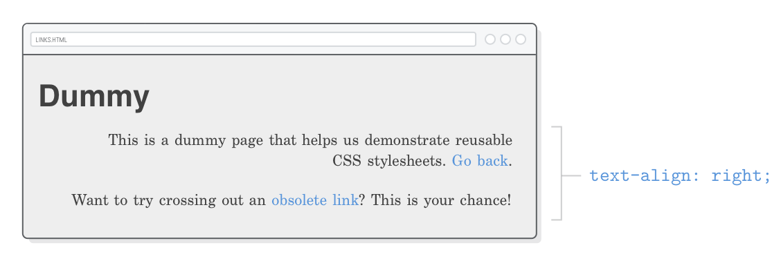
Text Alignment
The aptly named text-align property defines the alignment of the text in an HTML element.
p {
  text-align: left;
}
Other accepted values are right, center, or justify, but notice how it always aligns to the entire page:
This isn’t what you want for most websites. We’ll learn why this is the case in the next chapter when we start talking about CSS boxes.
Font Weight and Styles
The font-weight property defines the “boldness” of the text in an element, and the font-style property indicates whether it’s italicized or not.
Let’s say we don’t want our headings to be bold. Update our heading font rule in styles.css to match the following:
These properties clearly demonstrate the separation of content (HTML) from presentation (CSS). The following rules swap the appearance of the <em> and <strong> elements:
We don’t suggest doing this for real websites though. Font weights and styles will, however, become a lot more important once we start playing with custom fonts in the Web Typography chapter.
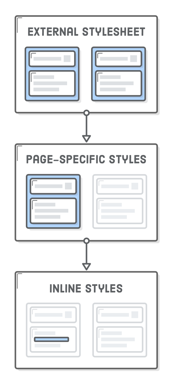
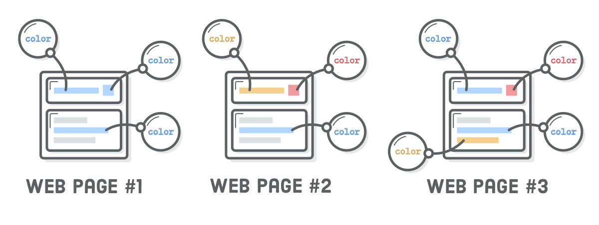
The Cascade
The “cascading” part of CSS is due to the fact that rules cascade down from multiple sources. So far, we’ve only seen one place where CSS can be defined: external .css files. However, external stylesheets are just one of many places you can put your CSS code.
The CSS hierarchy for every web page looks like this:
The browser’s default stylesheet
User-defined stylesheets
External stylesheets (that’s us)
Page-specific styles (that’s also us)
Inline styles (that could be us, but it never should be)
This is ordered from least to most precedence, which means styles defined in each subsequent step override previous ones. For example, inline styles will always make the browser ignore its default styles. The next few sections focus on the last two options because that’s what we have control over as web developers (in addition to the external styles we’ve already been working with).
We made an effort to get you started down the right path with external stylesheets. It’s important to understand page-specific and inline styles because you’ll most definitely encounter them in the wild, but external stylesheets are by far the best place to define the appearance of your website.
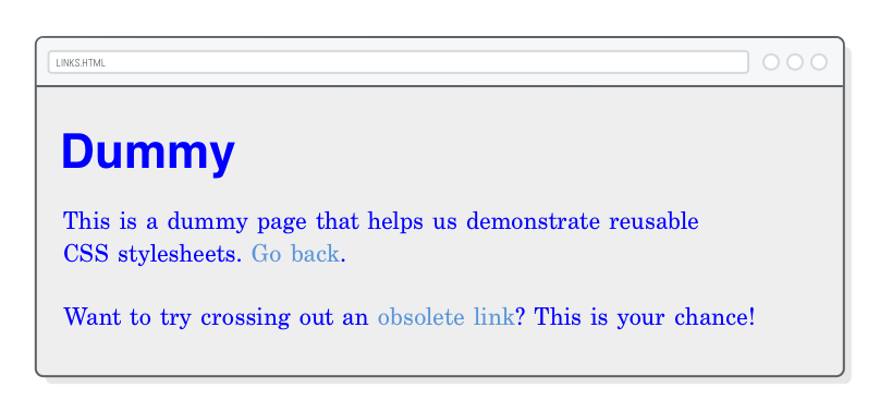
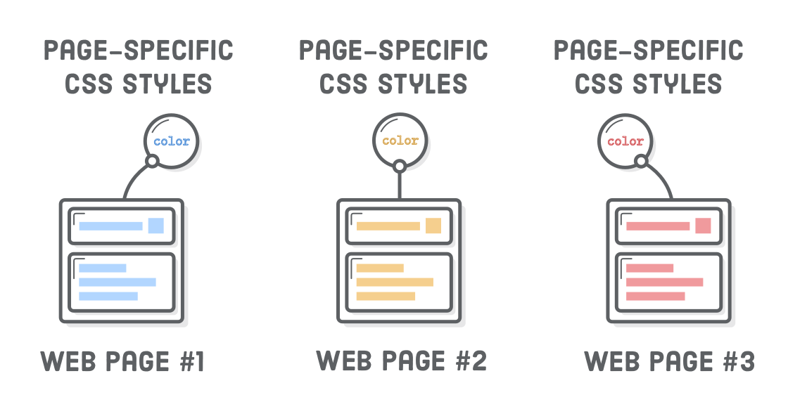
Page-Specific Styles
The <style> element is used to add page-specific CSS rules to individual HTML documents. The <style> element always lives in the <head> of a web page, which makes sense because it’s metadata, not actual content.
As an example, let’s apply some styles to our dummy.html page by updating its <head> element to this:
<head><metacharset='UTF-8'/><title>Dummy</title><linkrel='stylesheet'href='styles.css'/><style>body {
color: #0000FF; /* Blue */
}
</style></head>
These apply only to dummy.html. Our hello-css.html page won’t be affected. If you did it right, you should see bright blue text when you load dummy.html in a browser.
Anything you would put in our styles.css file can live in this <style> element. It uses the exact same CSS syntax as an external stylesheet, but everything here will override rules in our styles.css file. In this case, we’re telling the browser to ignore the color property we defined for <body> in our external stylesheet and use #0000FF instead.
The problem with page-specific styles is that they’re incredibly difficult to maintain. As shown in the above diagram, when you want to apply these styles to another page, you have to copy-and-paste them into that document’s <head>. Trying to track down redundant CSS rules in multiple .html files is much harder than editing a single .css file.
Page-specific styles occasionally come in handy when you’re in a rush, but it’s almost always better to store all your CSS in external stylesheets opposed to <style> elements.
Inline Styles
You can also stick CSS rules in the style attribute of an HTML element. In dummy.html, we have a link that doesn’t actually go anywhere. Let’s make it red via an inline style so we remember it’s a dead link:
<p>Want to try crossing out an <ahref='nowhere.html'style='color: #990000; text-decoration: line-through;'>obsolete link</a>?
This is your chance!</p>
Like page-specific styles, this is the same CSS syntax we’ve been working with. However, since it’s in an attribute, it needs to be condensed to a single line. Inline styles are the most specific way to define CSS. The color and text-decoration properties we defined here trump everything. Even if we went back and added a text-decoration: none to our <style> element, it wouldn’t have any effect.
Inline styles should be avoided at all costs because they make it impossible to alter styles from an external stylesheet. If you ever wanted to re-style your website down the road, you can’t just change a few rules in your global styles.css file—you’d have to go through every single page and update every single HTML element that has a style attribute. It’s horrifying.
That said, there will be many times when you need to apply styles to only a specific HTML element. For this, you should always use CSS classes instead of inline styles. We’ll explore classes in the CSS Selectors chapter.
Multiple Stylesheets
CSS rules can be spread across several external stylesheets by adding multiple <link/> elements to the same page. A common use case is to separate out styles for different sections of your site. This lets you selectively apply consistent styles to distinct categories of web pages.
For instance, if we had a bunch of product pages that looked entirely different than our blog, we could use the following. (We don’t actually have these stylesheets defined, so don’t bother adding them to our example project.)
<!-- All product pages have this --><head><linkrel='stylesheet'href='styles.css'/><linkrel='stylesheet'href='product.css'/></head>
<!-- While all blog posts have this --><head><linkrel='stylesheet'href='styles.css'/><linkrel='stylesheet'href='blog.css'/></head>
The order of the <link/> elements matters. Stylesheets that come later will override styles in earlier ones. Typically, you’ll put your “base” or “default” styles in a global stylesheet (styles.css) and supplement them with section-specific stylesheets (product.css and blog.css). This allows you to organize CSS rules into manageable files while avoiding the perils of page-specific and inline styles.
Summary
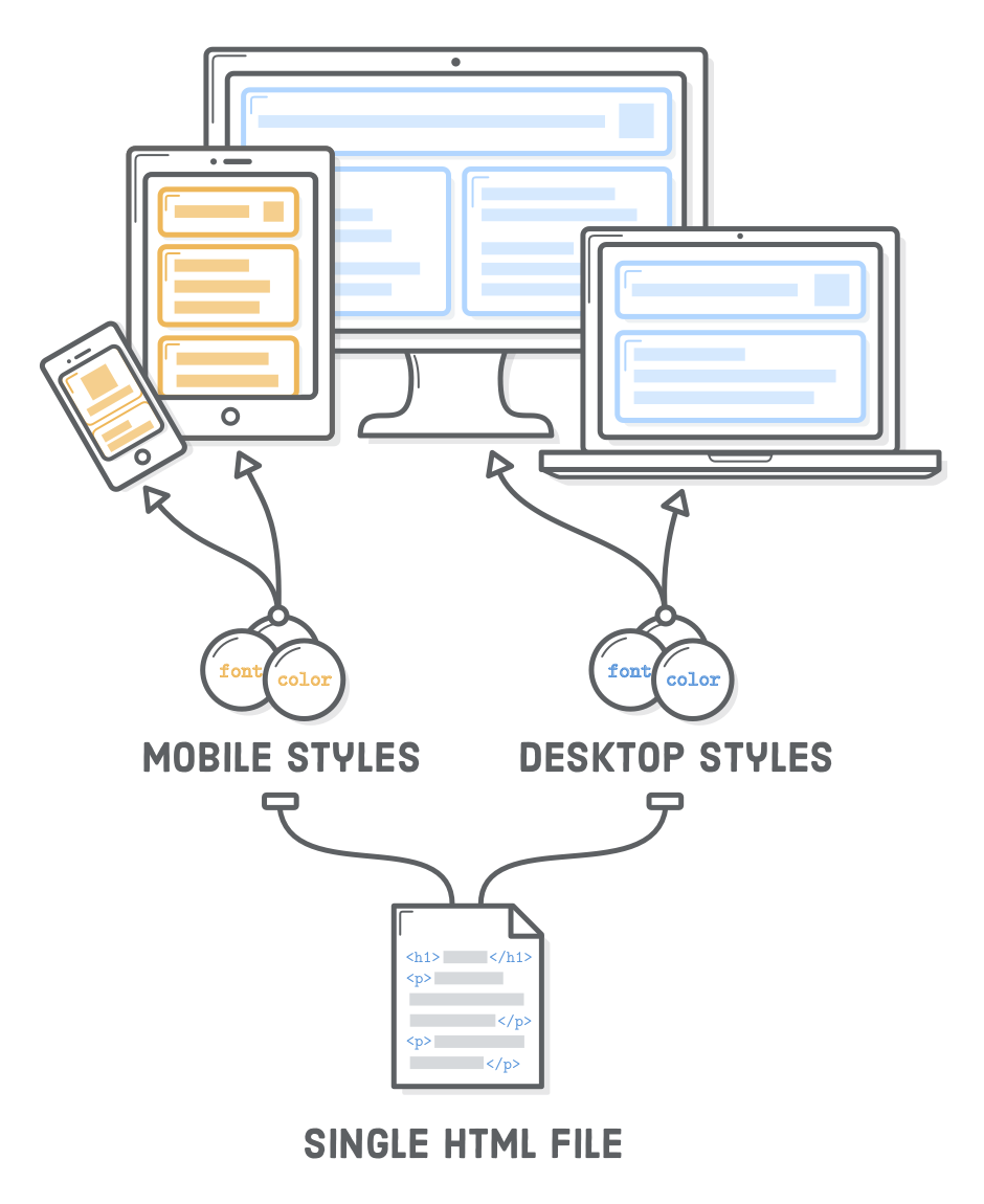
We talked a lot about separating content from presentation in this chapter. This not only allows us to reuse the same CSS stylesheet in multiple HTML documents, but also lets us conditionally apply different CSS rules to the same HTML content, depending on whether the user is on a mobile phone, tablet, or desktop computer. This latter part is called Responsive Design.
As a web developer, you’ll (hopefully) be given a polished design to work off of. Your job is to turn that mockup into a real web page leveraging your knowledge of CSS. As we mentioned earlier, setting individual CSS properties is actually quite simple. The hard part is combining the overwhelming number of built-in properties to create exactly what your web designer asked for—and do it quickly.
This chapter focused mostly on text formatting, but the Cascading Style Sheet language can do a whole lot more. In the next chapter, we’ll start exploring how CSS defines the layout of our web pages. On a final note, remember that you can always refer to MDN’s CSS Reference when you’re not sure how a particular property works.