A friendly tutorial about web fonts and basic typographic principles
“Web typography” refers to the appearance of all the text on your website. It includes basic CSS text properties like what font to use and whether it should be italic or not, but typography is much more than that. It’s about the space between and around letters, words, and lines. It’s the size of different runs of text in relation to one another, and the history behind each font family.
A lot of your typography decisions will come from a designer. The only problem is that typography is an invisible art. To actually understand what your designer is asking for, you need to be able to see typography the same way they do.
This chapter isn’t just about the mechanics of adding web fonts to your site or the CSS properties to move your text around. We’ll also explain how to properly leverage all these tools to make beautiful, professional websites. By the end of the chapter, you should not only know what your designer is talking about when they say something like, “Can we increase the leading of that paragraph?”, but also understand why they want you to increase it.
You may forget the specific CSS properties, but the typographic concepts we’re going to cover will stay with you for the rest of your life because they aren’t arbitrary rules—they’re grounded in function. They make your content more readable and help you communicate your message more effectively.
A Brief History of Web Fonts
We’re going to start this chapter by learning how to display your web pages in a custom font because that’s the most exciting aspect of modern web typography. However, web fonts have changed a lot over the last few years, so before we can start building out our example, we need a little primer on the various font formats floating around the Internet.
Web Safe Fonts
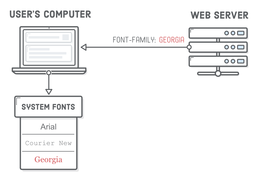
Long, long ago, web developers only had “web safe fonts” at their disposal. These were a collection of a dozen or so fonts that were pre-installed on most computers. There was no such thing as a custom font file that you could send to browsers to use on your website.
If you needed a special font, your only option was to export an image of the text you wanted to display and include it in your web page with an <img/> element. This was ridiculously limiting for web designers and resulted in some pretty hacky situations for developers. Honestly, we don’t know how everybody survived through that era of HTML and CSS.
Custom Web Fonts
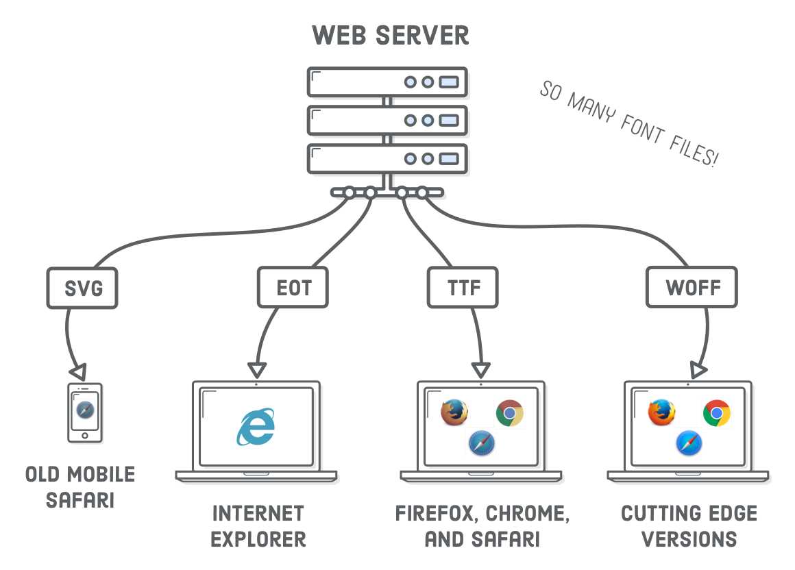
Around 2010, browsers began supporting custom web fonts, which was great, except for the fact that each browser and device required a different file format. Accordingly, most websites provided 4 different web font files:
File Format
Browser/Device
.svg
Very old Safari (iOS and Desktop)
.eot
Internet Explorer
.ttf
Everything except Internet Explorer
.woff
Newer browsers
This resulted in the “Bulletproof @font-face syntax”, which you’ll likely encounter at some point in your web development career.
WOFF Fonts
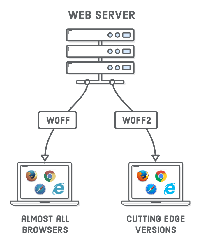
Recently, the industry has standardized on the Web Open Font Format (WOFF), so things have gotten a little bit simpler for us. Over 90% of modern browsers support .woff fonts, and support for its next evolution, .woff2, is growing. WOFF2 is similar to the original WOFF format, but offers a significant reduction in file size (which means better performance).
Eventually, you’ll only need to support WOFF2, but right now, we suggest providing both WOFF and WOFF2 web fonts to get decent coverage for older browsers and improved performance on modern ones. Unless legacy browsers make up a large chunk of your target audience, .ttf, .svg, and .eot fonts are a thing of the past.
Where to Find Web Fonts
There’s a ton of places on the web where you can download both free and premium web fonts, but our three favorites are listed below. Again, which font to use is usually up to your designer (and their budget), but as a developer, it’s still good to know the trade-offs between these options.
Note that Font Squirrel and Fontspring offer both web fonts and desktop fonts (.otf and .ttf files). WOFF is designed specifically for the needs of the modern web, while desktop fonts contain extra functionality useful for graphics editing programs like Adobe Illustrator. Be sure to download or purchase the web font version of the fonts you want to use—not just the desktop version.
Setup
Ok! We’re ready to experiment with web fonts. We’re going to be building this example website. We figured you probably don’t want to start this one from scratch, so go ahead and download the initial project. Unzip it and open up the web-typography folder with your favorite text editor. If you don’t have a favorite text editor, you might want to check out Atom.
We’ve got 6 HTML documents all using the same typo.css stylesheet. We’ll be demonstrating various typographic principles by adding some page-specific styles to each of these HTML files.
Open up one of the HTML files with a web browser, and you’ll find that our initial project is pretty close to the final example, minus all the web fonts and other CSS typography properties.
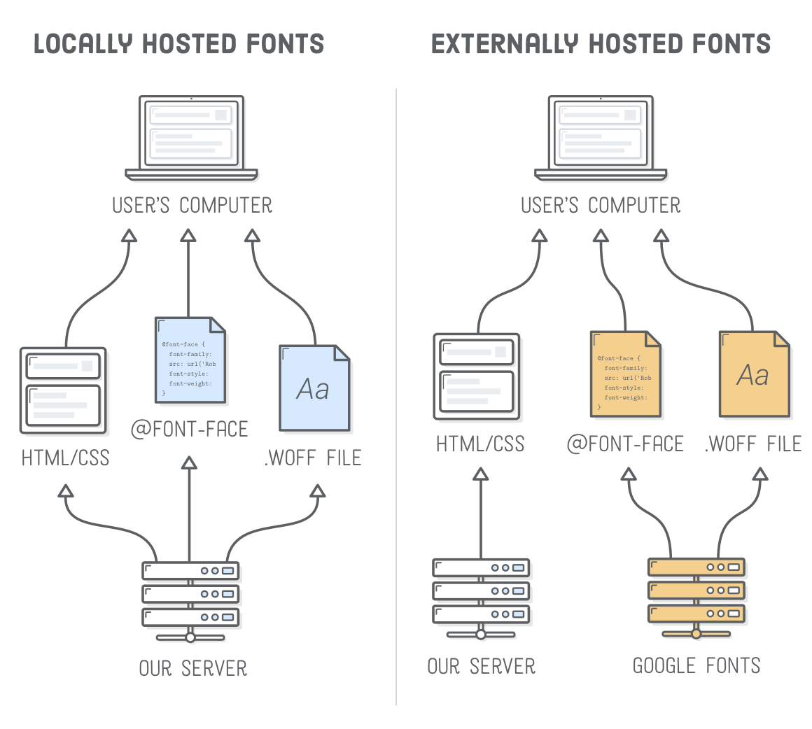
Locally Hosted Web Fonts
There are two distinct methods of adding web fonts to your website: locally hosted or externally hosted. We’ll take a look at both in this chapter. First, we’ll be adding a locally hosted web font to our example project. This is a three-step process:
Download a web font and add it to your project.
Embed the web font in your stylesheet.
Use the font elsewhere in your stylesheet.
We’ll be experimenting in the web-fonts.html and typo.css files. Go ahead and open those up in your text editor if you haven’t already.
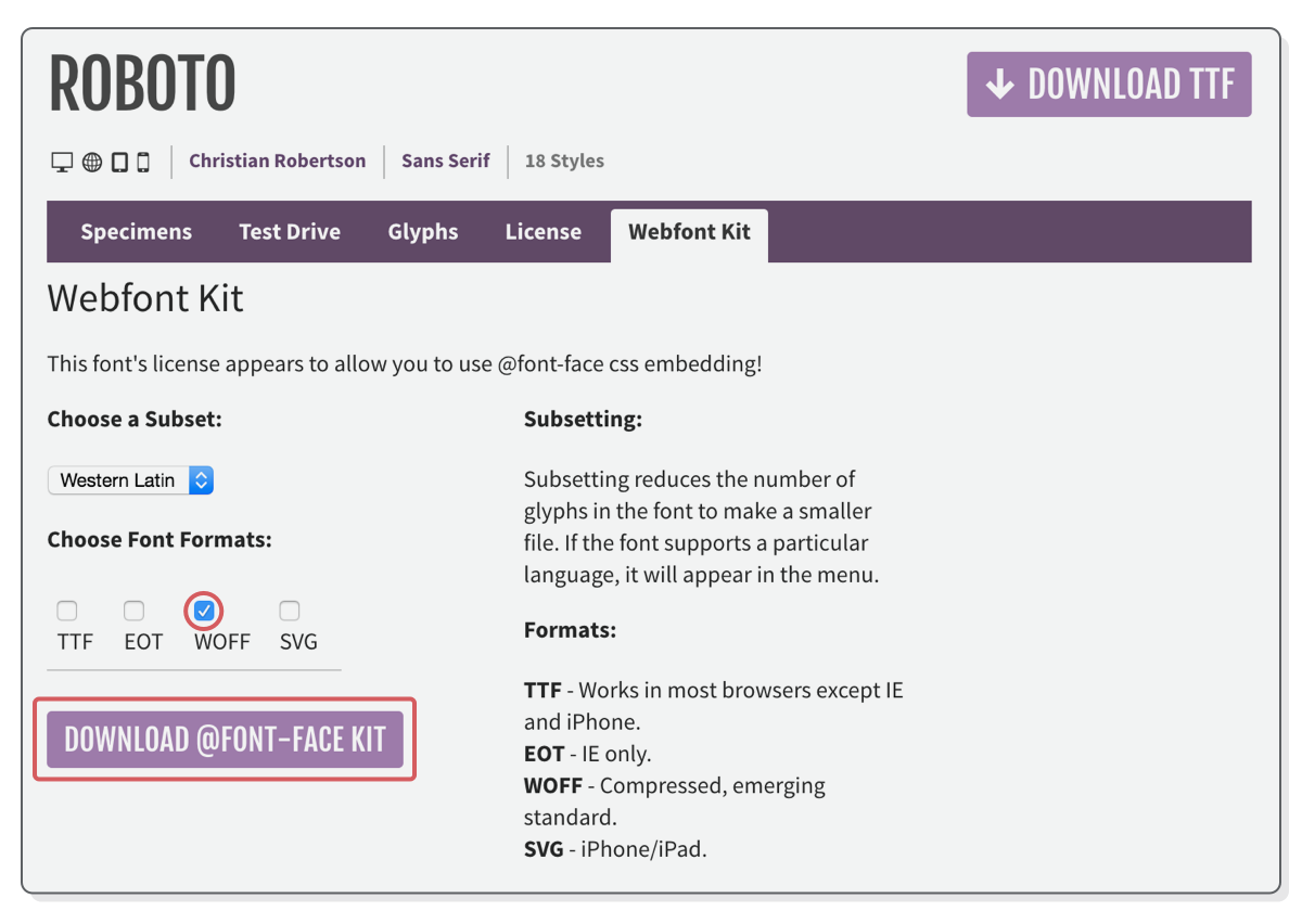
Hosting a WOFF File
So, we need to get our hands on a web font. Our example uses the free Roboto font, which you should download from Font Squirrel. Make sure to click the Webfont Kit tab, not the Download TTF button. Unclick all the formats except WOFF, since that’s the only one we’ll be using, then click the Download @font-face Kit button.
This will give you a ZIP file with a license, some instructions, and a web fonts folder containing a ton of subdirectories. The Roboto font comes in a bunch of different font faces like light, regular, bold, italic, and condensed. Each of those folders contains a different face. The one we want is called roboto_light_macroman. Open up that folder and copy the Roboto-Light-webfont.woff file into our web-typography project.
Embedding a Web Font
Sweet. We’ve got a WOFF file. To actually use it in our web page, we need to embed it into our stylesheet with the @font-face “at-rule”. Web fonts must always be included at the top of a stylesheet, so add the following to the very beginning of typo.css:
The font-family property defines how we’ll refer to this font later on. This operates as an internal label, so it can be anything you want. It doesn’t need to relate to the official name of the font, but it’s usually more intuitive if it does. As we’ll see in a moment, it’s a good idea to keep the name as generic as possible (e.g., Roboto instead of Roboto Light).
Next, we have the src property, which defines the path to the .woff file via the url() notation. The path can be absolute, relative, or root-relative. If you use a relative path like we did here, it will always be relative to the .css file—not the HTML document. The format() notation lets browsers know which web font file format it is.
If you reload web-fonts.html page, you won’t see any change because @font-face only gave us access to our .woff file. We still need to use it somewhere else in our stylesheet.
Using a Web Font
Remember from Defining Fonts that the CSS font-family property defines which font a particular HTML element uses. After adding our @font-face at-rule, we can use Roboto as a valid value for font-family anywhere else in our stylesheet.
Let’s make Roboto Light the default font for our entire example project by changing the font-family in the body selector of typo.css:
body {
font-family: 'Roboto', sans-serif; /* Add 'Roboto' here */font-size: 18px;
line-height: 1.8em;
color: #5D6063;
}
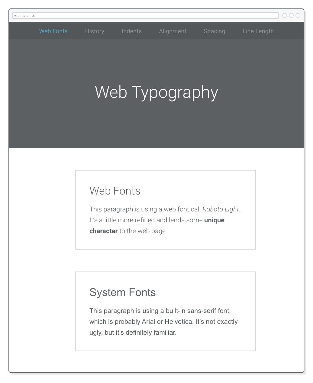
Everything should now render as Roboto Light, which means we lost our comparison with the sans-serif system font in web-fonts.html. Fix this by adding a page-specific style to the <head> of our web-fonts.html file:
The .system-fonts class is applied to the second box in web-fonts.html. The above rule takes precedence over the body rule in typo.css, so when you open up web-fonts.html in a browser, you should see our Roboto Light web font on the top and the default system font on the bottom:
Font Families and Font Faces
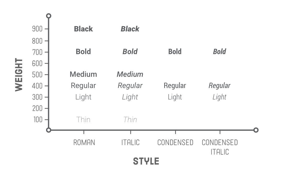
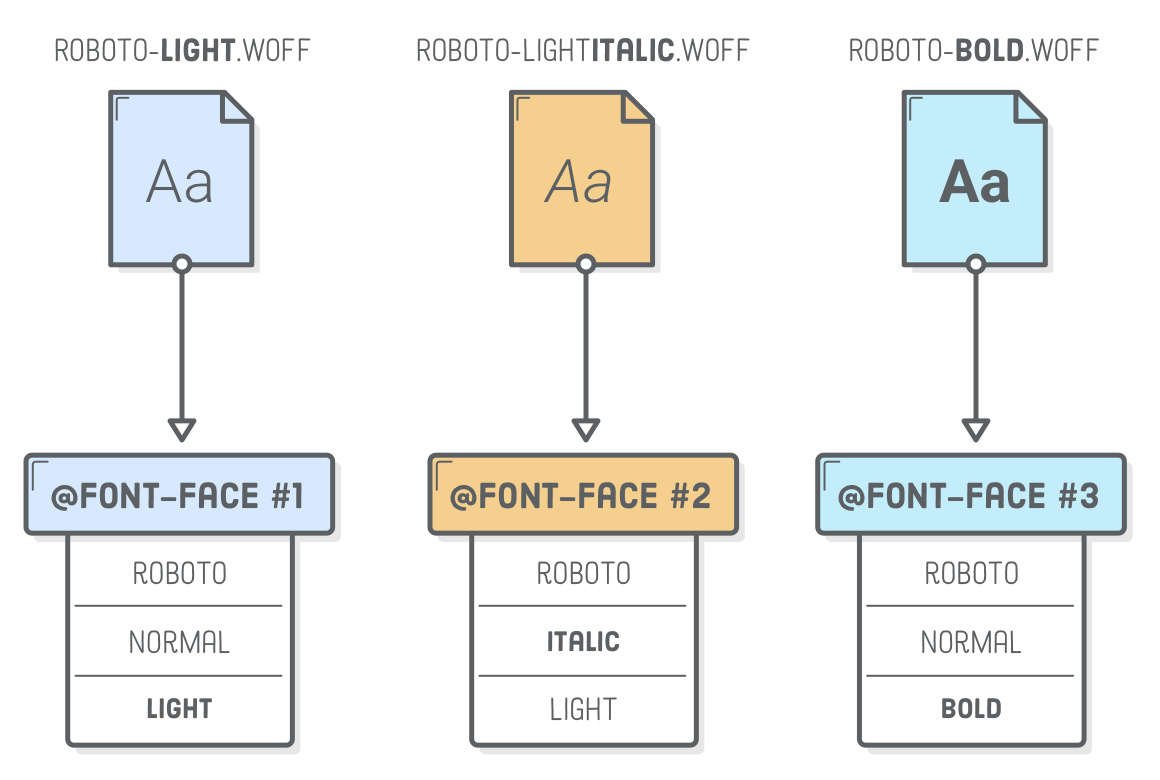
A single font “family” is made up of multiple font “faces”. Each font face is a different weight or style in the family. “Weight” refers to the boldness of a particular face, and “style” refers to whether it’s roman (upright), italic, condensed, extended, or some other variant in the family.
In our example, Roboto Light is one font face in the Roboto family. The other 17 faces in the ZIP file we downloaded earlier can be visualized like so:
In CSS, font weights are expressed as numeric values between 100 and 900. Fortunately, there are relatively standardized, human-friendly terms for each of these numeric values. “Black” usually means 900, “bold” is 700, “regular” is 400, etc. As you can see above, most families don’t supply a face for every single weight. Roboto is missing “extra light” (200), “semi bold” (600), and “extra bold” (800).
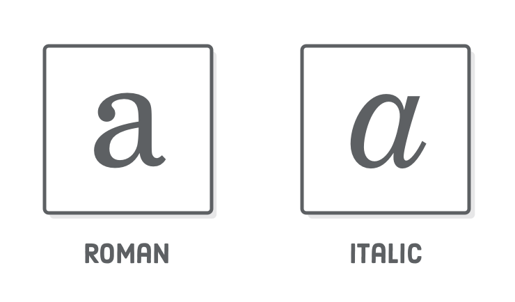
It’s worth noting that each style and weight combination is designed as an entirely distinct face. In a high-quality font family, the condensed styles aren’t simply squashed versions of the roman faces, nor is the bold face merely a thicker version. Each letter in every face is hand-crafted to ensure it provides a uniform flow to its text.
This is particularly apparent in the italic and roman faces of many serif fonts. For instance, the lowercase “a” in Century Schoolbook FS (the font you’re reading right now) takes on a completely different shape when it’s italicized.
Fakin’ It
Why does this weight and style stuff matter to us? The design of most websites utilizes multiple faces in the same family, so we need to know how to embed several .woff files that represent related faces.
But first, let’s take a look at what happens when we don’t offer multiple faces. Update the left-hand paragraph in web-fonts.html to include an <em> and a <strong> element:
<sectionclass='section section--gray'><h2>Web Fonts</h2><p>This paragraph is using a web font call <em>Roboto Light</em>. It’s a
little more refined and lends some <strong>unique character</strong> to
the web page.</p></section>
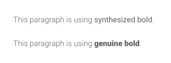
When you reload the page, you’ll notice that the bold text isn’t really all that bold. This is because it’s being synthesized. We didn’t supply a bold font face for the <strong> element to use, so the browser is trying to fake it by auto-converting Roboto Light into a thicker face. The same thing is going on with the italics in the <em> element, but it’s a little bit harder to tell. This auto-conversion almost always results in low-quality typography.
To verify that the bold and italic faces really are being synthesized, try adding the following rule to typo.css. The font-synthesis property determines if a browser is allowed to fake it or not. At the time of this writing, only Firefox actually pays attention to font-synthesis, so this won’t work in Chrome or Safari:
/* This will only work in Firefox */em, strong {
font-synthesis: none;
}
Open up web-fonts.html in Firefox, and the <em> and <strong> elements will no longer be italic or bold—the entire paragraph will be in roman Roboto Light.
Multiple Font Faces (The Wrong Way)
Let’s try adding Roboto Light Italic and Roboto Bold faces to our example project. Copy over the following files from the Roboto ZIP file we downloaded earlier into our web-typography folder:
A .woff file represents a single face in a particular font family, and @font-face lets us embed that face in our stylesheet. The naive way to embed these new WOFF files would be to simply add more @font-face declarations and change the font-family and src properties as necessary. Try adding the following to the top of typo.css:
/* DON'T NAME FONT FAMILIES LIKE THIS */
@font-face {
  font-family: 'Roboto Light Italic';
  src: url('Roboto-LightItalic-webfont.woff') format('woff');
}

@font-face {
  font-family: 'Roboto Bold';
  src: url('Roboto-Bold-webfont.woff') format('woff');
}
Then, to use these faces in our <em> and <strong> elements, we need the following rules:
/* THIS IS A LITTLE AWKWARD */em {
font-family: 'Roboto Light Italic', serif;
}
strong {
font-family: 'Roboto Bold', serif;
}
This will work, and you should now see proper italic and bold fonts when you reload web-fonts.html in your browser. The problem is that manually specifying the font-family every time we want to use an italic or bold font is a little weird. We should be using the CSS font-style and font-weight properties for this.
We ended up in this awkward situation because of the way we embedded our new .woff files. Using separate font-family values in @font-face makes them look like entirely unrelated font faces. It doesn’t reflect the fact that they are all actually part of the Roboto family.
For this reason, you should never use the above technique to embed multiple faces that are in the same font family. Go ahead and delete both of the above snippets before moving on.
Multiple Font Faces (The Right Way)
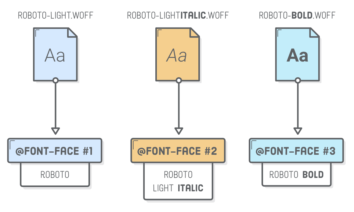
To maintain the familial relationship between our three font faces, they all need to use a shared Roboto value for their font-family property. To distinguish between our light, italic, and bold faces, we’ll add font-style and font-weight properties to the at-rule. Replace all the @font-face declarations in typo.css with the following:
Think of each @font-face at-rule as a description of the underlying .woff file. The first @font-face is saying it’s a Roboto font that’s roman (normal) and has a font weight of 300 (aka “light”). The second says it’s also in the Roboto family and has a weight of 300, but it’s italic. Finally, the third at-rule lets our the browser know that Roboto-Bold-webfont.woff contains the 700-weight (aka “bold”) roman face.
Letting the browser know that our font faces are related makes our CSS much more intuitive. We can set the default font family and weight in our body selector. Then, when we want to use italics or bold for a particular element, we can simply specify a font-style or font-weight and the browser will pull the corresponding .woff file:
body {
  font-family: 'Roboto', sans-serif;
  font-weight: 300;
  /* ... */
}

em {
  font-style: italic;
}

strong {
  font-weight: bold;  /* Or 700 */
}
These happen to be the default font-style and font-weight values for <em> and <strong> elements, so we don’t really need to include the last two rules here. Note that the only human-friendly keywords available for font-weight are normal (400) and bold (700). Any other boldness levels need to set numerically.
Externally Hosted Web Fonts
Ok! That was complicated. Next, we’re going to explore the easier method of using web fonts: externally hosted via Google Fonts. This lets us skip the first two steps of locally hosted fonts. Instead of adding .woff files to our project and embedding them with @font-face, we can let Google Fonts do this part for us.
In this section, we’re going to be working on history.html, so open up that file in both your text editor and a web browser. If you want a brief history of typography going all the way back to the first printing press, take a quick read through the example text. Right now, each section in history.html is using Roboto Light, but we’re going to change all of them to be representative of the period they’re talking about.
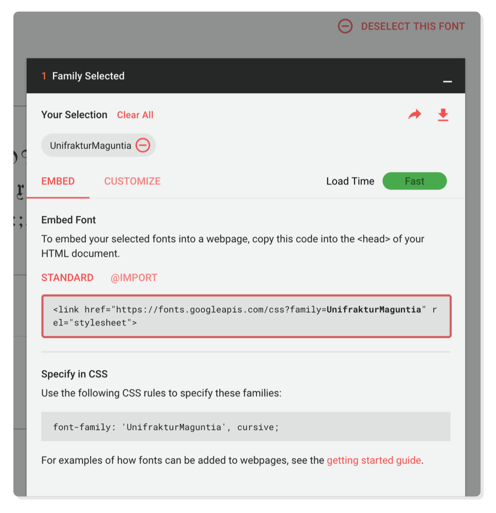
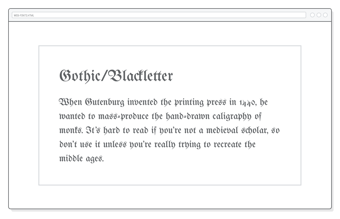
Let’s begin by changing the font for the Gothic/Blackletter section. In Google Fonts, search for UnifrakturMaguntia. It should look like something a monk wrote in the middle ages. Click Select this font. In the pop-up menu, you’ll see a <link/> element. Copy this into the <head> of history.html, above the <link/> element that includes our typo.css stylesheet.
Remember that <link/> is how we include an external stylesheet, and that’s exactly what the above HTML is doing. However, instead of linking to a local CSS file, it’s including some CSS defined by Google Fonts. If you paste the href value into your browser, you’ll find the same @font-face declaration that we used in the previous section—except we didn’t actually have to write it this time. Yay!
Now that we’ve embedded our UnifrakturMaguntia web font, we should be able to use it to style any HTML element we want. Add the following to the <head> of history.html:
That first section has a class='blackletter' attribute, so it should now be printed in gothic letters:
Google Fonts are a quick and easy solution, but professional sites should typically use locally hosted web fonts. This gives you a lot more flexibility (you’re not limited to Google’s font offering) and can have performance/reliability gains if you’ve optimized the rest of your site correctly.
Too Many Font Files
Speaking of performance, let’s do something awful. There’s another 10 sections on our history.html page, and we want to give each one its own web font. We can embed multiple fonts in a single <link/> element, so change our Google Fonts stylesheet to include the rest of them:
Note that you can generate this in Google Fonts by selecting multiple fonts before copying the <link/> element. Next, add all these new fonts to the <style> element of history.html:
Now, each section of history.html is rendered in a font from the era it’s describing. This serves as a nice introduction to the historic significant of different fonts, but you should never, ever include this many web fonts on a real web page.
Don’t forget that each web font is actually a .woff or .woff2 file that your browser needs to load before it can render the page. More fonts means longer load times. The key to using web fonts effectively is to find a balance between performance (fewer web fonts) and a beautifully typeset document (more web fonts).
And that’s more than you could ever want to know about web fonts. The rest of this chapter shifts gears into basic typographic principles. These are simple guidelines (with simple CSS implementations) that often make the difference between a professional web page and an amateur one.
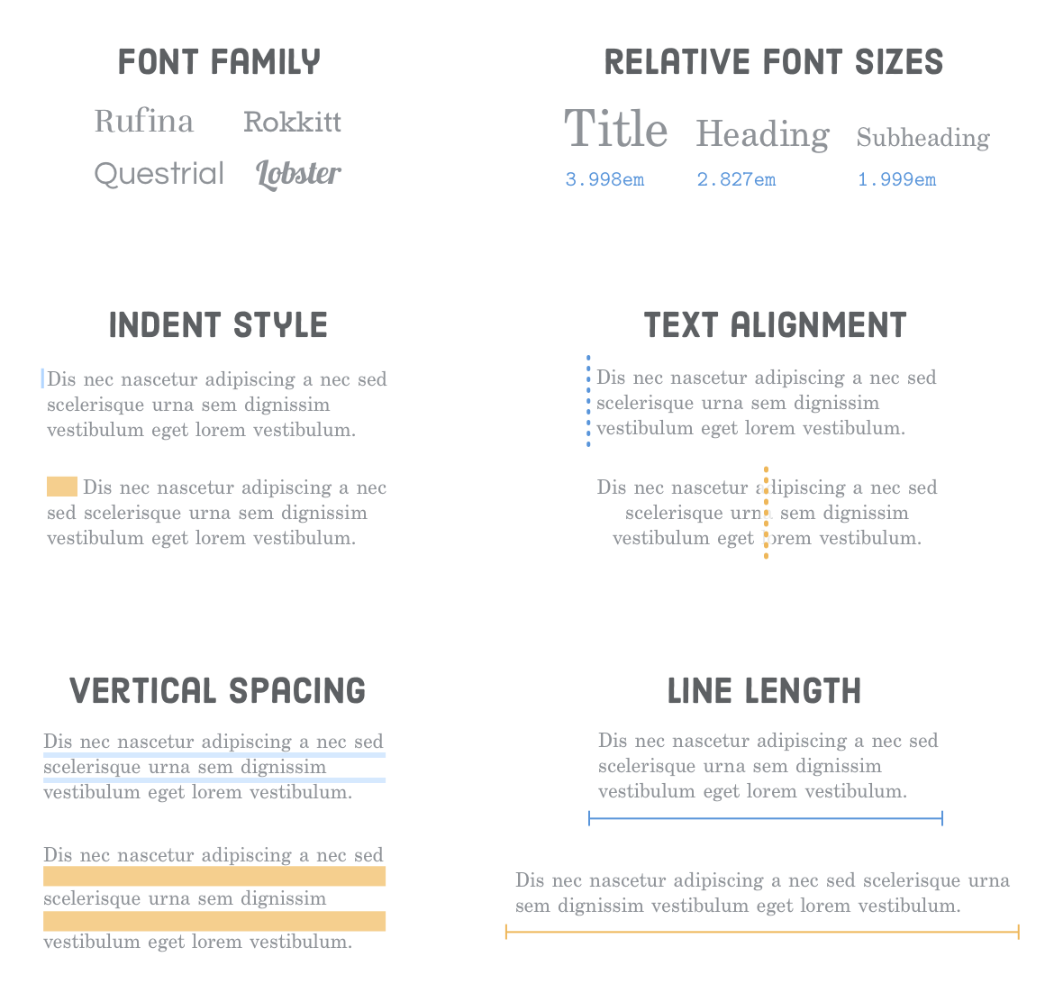
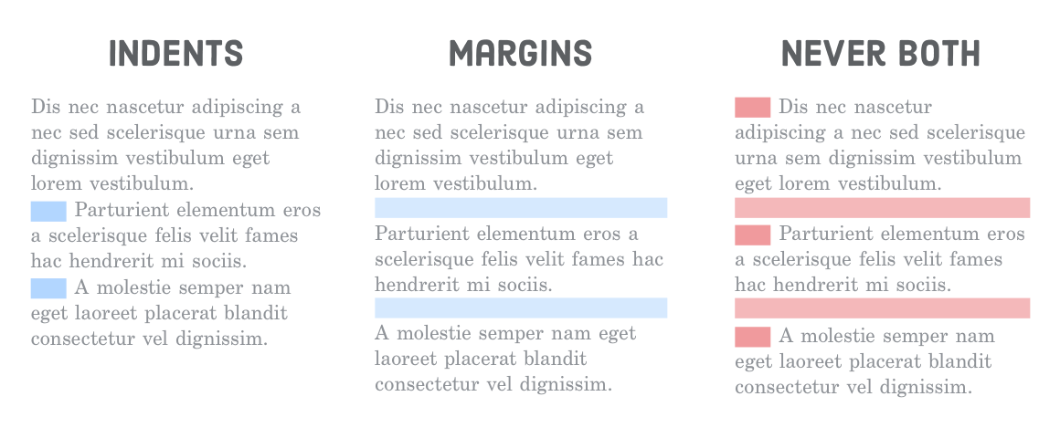
Paragraph Indents
Separating paragraphs from one another is one of the most fundamental functions of typography. There’s two generally accepted solutions: either use a first-line indent or a margin between the paragraphs. Your readers (hopefully) aren’t stupid—they don’t need two signs that a new paragraph is happening, so never use both an indent and a margin. That would be redundant.
The CSS text-indent property defines the size of the first-line indent of a particular element (usually a <p>). We can explore this in our indents.html page. Go ahead and change the existing bottom margin styles in the first section to an indent by adding the following rules to the <style> element:
Note that the first paragraph after a heading should never be indented because, well, it’s usually pretty obvious that it’s a new paragraph. This is a pretty good use case for the :first-of-type pseudo-class.
And here’s a negative example so we remember what not to do. Add this to the page-specific styles in indents.html:
/* DESIGNERS WILL JUDGE YOU FOR THIS */.never-bothp {
text-indent: 1em;
margin-bottom: 1em;
}
It might seem silly, but we’re not kidding when we say that good designers will judge you for this.
Text Alignment
The alignment of text has a subconscious impact on how you read it. You’ve probably never noticed it before, but your eyes don’t move in a smooth motion as they read over a paragraph—they jump from word to word and from line to line. Your eyes fixate on certain spots and skip over other ones.
In a well-designed HTML document, text alignment is never an arbitrary decision. It takes into account this little bit of human physiology. Good text alignment actually makes it easier for users to read your content by giving their eyes an anchor to jump to when they move from line to line.
The next few sections explain the proper times to use left, center, right, and justified text alignment. All of these examples rely on the text-align property, which controls the text alignment of a particular HTML element. We set up the alignment.html page in our example project with some convenient scenarios.
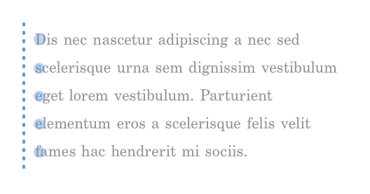
Left Alignment
Most of your text should be left-aligned because it gives the reader a vertical anchor to jump back to on every line. Long runs of text, in particular, should almost always be left-aligned. Short runs of text and headings have a little bit more leeway.
Left alignment is the default value for text-align, but if we wanted to be explicit, we could add the following rule to the <style> element of our alignment.html file:
<style>.left {
text-align: left;
}
</style>
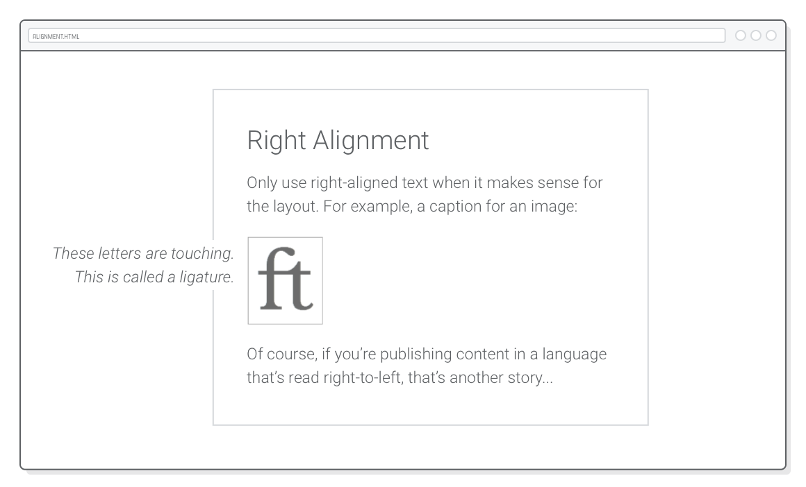
Of course, if you’re working on a website that’s in a language that’s written right-to-left instead of left-to-right (like Arabic), you can go ahead and swap all this advice with the Right Alignment section below.
Center Alignment
Center-aligned text doesn’t have that anchor, so it’s easier for the eye to get lost when it tries to jump to the next line. It’s best suited for short line lengths (more on that later) and for special kinds of content like poems, lyrics, and headings.
Go ahead and center-align the second paragraph in alignment.html with another page-specific style:
.center {
  text-align: center;
}
Notice how the page now feels a little disjointed. The center-aligned second paragraph breaks the flow of the left-aligned first paragraph. Generally speaking, text alignment should be consistent throughout a web page. If you’re going to center a heading, center all of your headings.
Right Alignment
Another consideration when choosing text alignment is the relationship it creates with the surrounding elements. For instance, take a look at that third section in alignment.html. We want to move the image’s caption to the left of the image and right-align it to make it look like it’s attached to the image:
Our example image is wrapped in a <figure> and the caption text is in a <figcaption>, so adding the following to the <style> element of alignment.html should result in the above layout.
This also happens to be a good example of advanced positioning. The relative position of the <figure> sets the coordinate system for the <figcaption>’s absolute positioning. By nudging the caption left by 220px and giving it an explicit width of 200px, we get a nice 20-pixel margin between the image and its caption.
Like centered text, right alignment should usually be reserved for these kinds of special design scenarios because its jagged left edge makes it harder for the reader to find the next line.
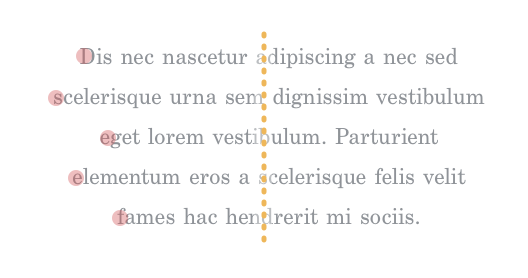
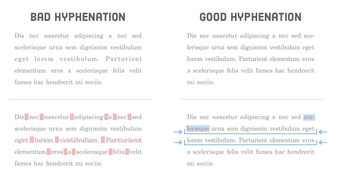
Justified Text
Justified text is created by subtly adjusting the space between words/letters and splitting long words with hyphens until each line is the same width. Without a high-quality hyphenation engine, justified text results in awkwardly large spaces between words. These uneven spaces make it harder for the eye to move horizontally across the text.
Unfortunately, most browsers don’t have any kind of built-in hyphenation engine, so you’re better off avoiding justified text in HTML documents. We can take a look by adding one more text-align rule to our alignment.html file:
.justify {
  text-align: justify;
}
Compare this with the left-aligned paragraph. It’s subtle, but the left-aligned paragraph is more uniform and inviting.
Vertical Text Spacing
Just as alignment isn’t an arbitrary decision, neither is the space between text. In this section, we’re concerned with the responsible use of three CSS properties:
margin-top (or padding-top)
margin-bottom (or padding-bottom)
line-height
The first two should be pretty familiar by now, and they define the vertical space between separate paragraphs. The new line-height property determines the amount of space between lines in the same paragraph. In traditional typography, line-height is called “leading” because printers used little strips of lead to increase the space between lines of text.
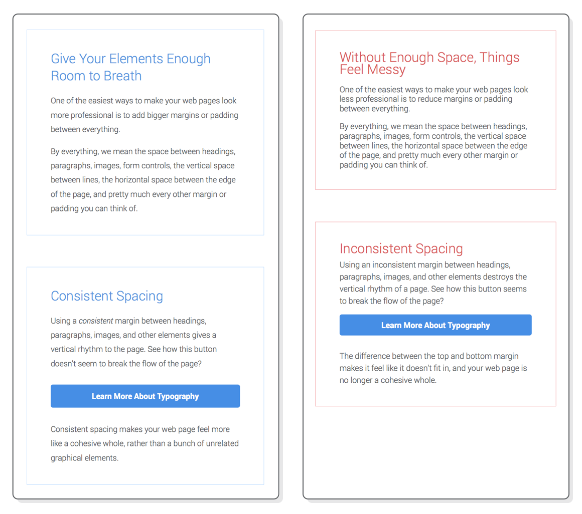
Together, these properties control the “vertical rhythm” of a web page. There’s all sorts of techniques to figure out the “optimal” vertical rhythm for a given layout, but the general principles are:
Give things enough space to breath.
Use consistent spacing throughout the page.
To demonstrate this, we’re going to destroy the vertical rhythm in the second half of our spacing.html page. Go ahead and add the following page-specific styles to spacing.html
A few small changes to line height, paddings, and margins can have a dramatic impact on the quality of a page:
There’s a surprising amount of math and psychology that goes into calculating the vertical rhythm of a page, but that’s a job for your designer. As a developer, you need to know the CSS properties to implement what they’re asking for. More importantly, you have to understand that your designer really cares about this kind of stuff, so you should be paying very careful attention to your margin, padding, and line-height properties.
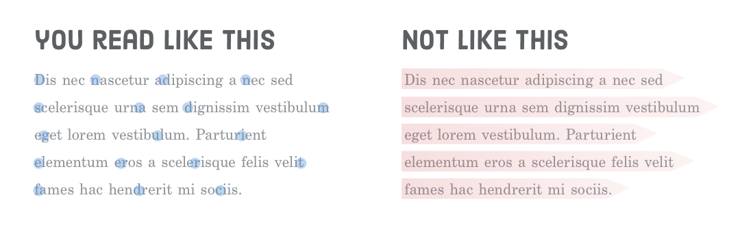
Line Length
If the vertical spacing of your text isn’t arbitrary, it should be no surprise that the horizontal spacing isn’t, either. “Line length” or “measure” refers to the horizontal length of your text. You can think of it as the number of characters or words that fit into a single line. Measure has everything to do with the following CSS properties:
width
margin-left (or padding-left)
margin-right (or padding-right)
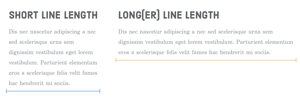
A good rule-of-thumb is to limit the number of characters on a single line to around 80. Like alignment, this subtly affects the readability of your content. It takes energy for your eye to move from the left edge of a paragraph to the right, and the farther it has to scan, the faster it gets tired. Longer lines also make it easier to get lost when you finish a line and need to jump back to the beginning of the next line.
These are the reasons why so many websites (including this one) use fixed-width layouts or split content into multiple columns on wider screens. Without constraining the width of the page or dividing it into manageable columns, line length becomes unacceptably long.
In our example project, the line-length.html file has decent measure. Let’s see what happens when we break the bottom half of the page by adding the following to its <head>:
<style>
  @media only screen and (min-width: 580px) {
    .not-so-manageable {
      max-width: 100%;
      margin-left: 2em;
      margin-right: 2em;
    }
  }
</style>
Now, the second section stretches to fill the full width of the browser window. It feels a little bit more unapproachable due to the long line length. Again, the goal of good web typography is to make it as easy as possible for visitors to digest your content.
Other Basic Typography Guidelines
That should be enough to get you on your way towards quality web typography. Typography is a whole industry, and we’ve barely scratched the surface. However, getting any deeper into it would be more design than web development, so we’ll just leave you with a few final guidelines:
Use a font-size between 14px and 20px for the body element.
Use “curly quotes” and apostrophes with the ’, ‘, ”, and “ HTML entities.
Don’t use text-decoration: underline except for hover states.
Use real italic fonts over synthesized ones if not it’s too much of a performance burden.
If you find this stuff fascinating, Practical Typography has a fantastic list of general rules to follow when typesetting a document.
Summary
The goal of this chapter was twofold:
Learn the mechanics of web fonts and basic CSS typography properties.
Understand how designers think about typography.
You might not be able to create a beautifully typeset web page from scratch after reading this chapter, but that wasn’t the point. It was to make you aware of the invisible art of typography. You should now have the vocabulary to talk about things like font families, faces, weights, and styles, as well as leading, measure, and vertical rhythm.
The most important thing you should take away from this chapter is the fact that nothing is arbitrary in a well-designed web page. The font sizes, indent style, text alignment, line height, margins, and every other tiny facet of the page was carefully considered. There was a purpose behind all of these decisions.
All of the CSS properties we’ve covered throughout this tutorial are actually kind of simple. When it comes down to it, we’ve really just been moving a bunch of boxes around, changing some colors, and altering the appearance of our text. The meaning behind these things comes from the underlying design and the business goals of the website you’re implementing.
But, that’s for another tutorial. Believe it or not, you’ve reached the end of HTML & CSS is Hard. We’ve covered all the HTML elements and CSS properties you need to build professional web pages. The only thing missing is experience. Your next step is to practice all these new skills by building a bunch of web pages from scratch.