A friendly web development tutorial for capturing user input
HTML form elements let you collect input from your website’s visitors. Mailing lists, contact forms, and blog post comments are common examples for small websites, but in organizations that rely on their website for revenue, forms are sacred and revered.
Forms are the “money pages.” They’re how e-commerce sites sell their products, how SaaS companies collect payment for their service, and how non-profit groups raise money online. Many companies measure the success of their website by the effectiveness of its forms because they answer questions like “how many leads did our website send to our sales team?” and “how many people signed up for our product last week?” This often means that forms are subjected to endless A/B tests and optimizations.
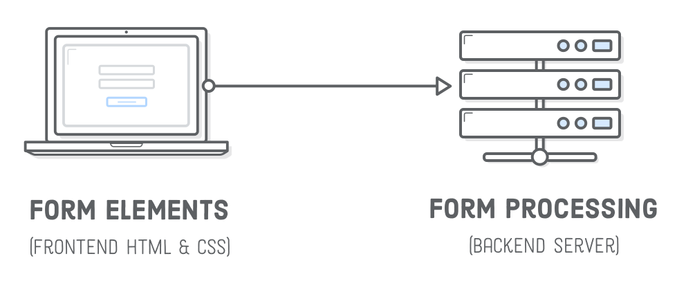
There are two aspects of a functional HTML form: the frontend user interface and the backend server. The former is the appearance of the form (as defined by HTML and CSS), while the latter is the code that processes it (storing data in a database, sending an email, etc). We’ll be focusing entirely on the frontend this chapter, leaving backend form processing for a future tutorial.
Setup
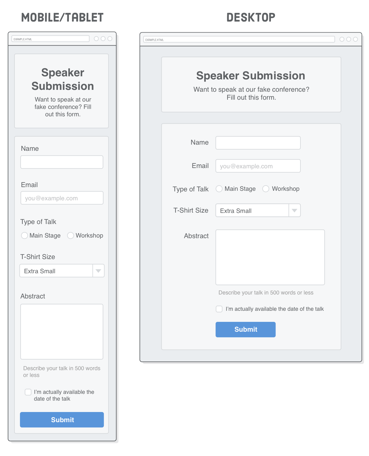
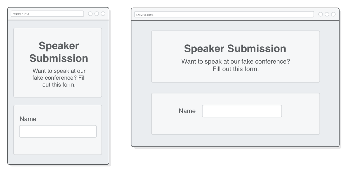
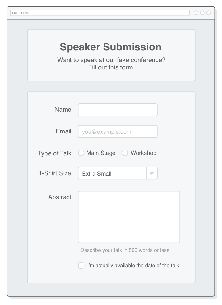
Unfortunately, there’s really no getting around that fact that styling forms is hard. It’s always a good idea to have a mockup representing the exact page you want to build before you start coding it up, but this is particularly true for forms. So, here’s the example we’ll be creating in this chapter:
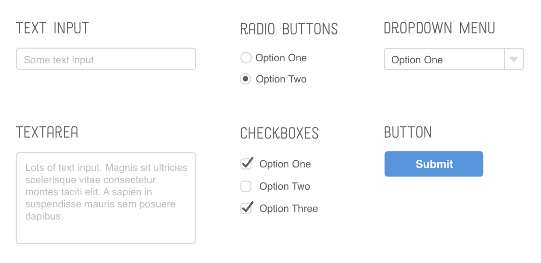
As you can see, this is a speaker submission form for a fake conference. It hosts a pretty good selection of HTML forms elements: various types of text fields, a group of radio buttons, a dropdown menu, a checkbox, and a submit button.
Create a new Atom project called forms and stick a new HTML file in it called speaker-submission.html. For starters, let’s add the markup for the header. (Hey look! It has some semantic HTML!)
<!DOCTYPE html><htmllang='en'><head><metacharset='UTF-8'/><title>Speaker Submission</title><linkrel='stylesheet'href='styles.css'/></head><body><headerclass='speaker-form-header'><h1>Speaker Submission</h1><p><em>Want to speak at our fake conference? Fill out
this form.</em></p></header></body></html>
Next, create a styles.css file and add the following CSS. It uses a simple flexbox technique to center the header (and form) no matter how wide the browser window is:
Notice that we’re adhering to the mobile-first development approach that we discussed in the Responsive Design chapter. These base CSS rules give us our mobile layout and provide a foundation for the desktop layout, too. We’ll create the media query for a fixed-width desktop layout later in the chapter.
HTML Forms
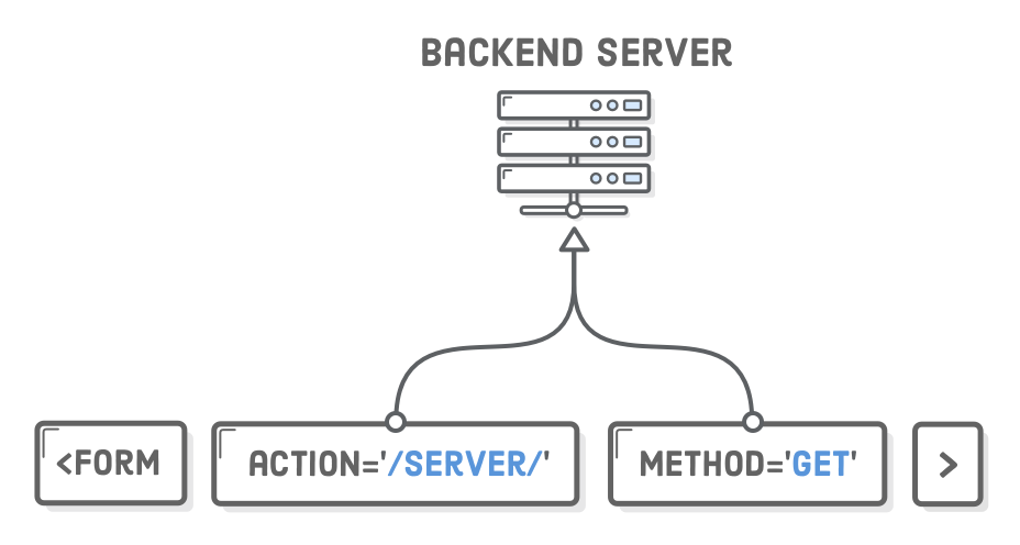
On to forms! Every HTML form begins with the aptly named <form> element. It accepts a number of attributes, but the most important ones are action and method. Go ahead and add an empty form to our HTML document, right under the <header>:
The action attribute defines the URL that processes the form. It’s where the input collected by the form is sent when the user clicks the Submit button. This is typically a special URL defined by your web server that knows how to process the data. Common backend technologies for processing forms include Node.js, PHP, and Ruby on Rails, but again, we’ll be focusing on the frontend in this chapter.
The method attribute can be either post or get, both of which define how the form is submitted to the backend server. This is largely dependent on how your web server wants to handle the form, but the general rule of thumb is to use post when you’re changing data on the server, reserving get for when you’re only getting data.
By leaving the action attribute blank, we’re telling the form to submit to the same URL. Combined with the get method, this will let us inspect the contents of the form.
Styling Forms
Of course, we’re looking at an empty form right now, but that doesn’t mean we can’t add some styles to it like we would a container <div>. This will turn it into a box that matches our <header> element:
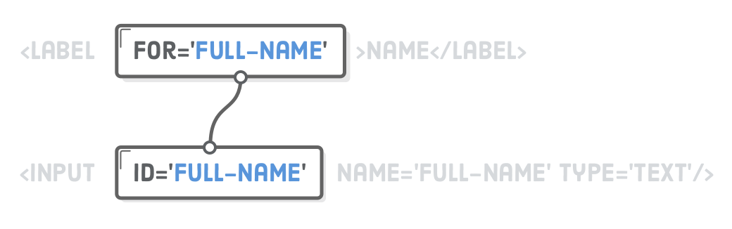
First, we have a container <div> to help with styling. This is pretty common for separating input elements. Second, we have a <label>, which you can think of as another semantic HTML element, like <article> or <figcaption>, but for form labels. A label’s for attribute must match the id attribute of its associated <input/> element.
Third, the <input/> element creates a text field. It’s a little different from other elements we’ve encountered because it can dramatically change appearance depending on its type attribute, but it always creates some kind of interactive user input. We’ll see other values besides text throughout the chapter. Remember that ID selectors are bad—the id attribute here is only for connecting it to a <label> element.
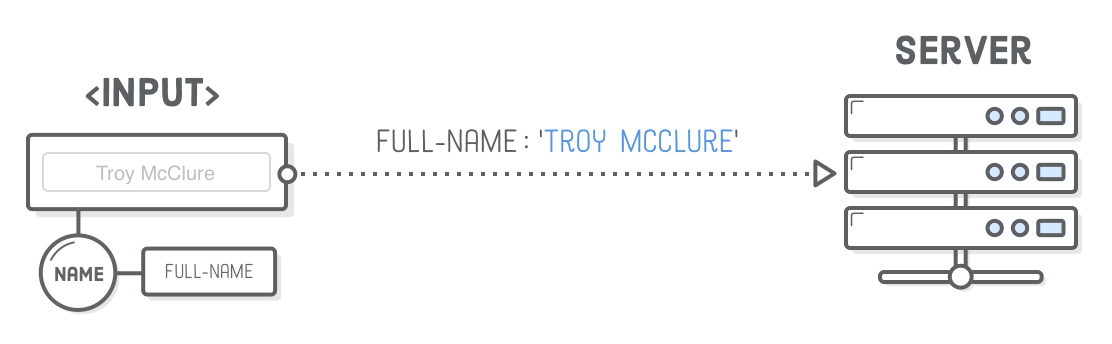
Conceptually, an <input/> element represents a “variable” that gets sent to the backend server. The name attribute defines the name of this variable, and the value is whatever the user entered into the text field. Note that you can pre-populate this value by adding a value attribute to an <input/> element.
Styling Text Input Fields
An <input/> element can be styled like any other HTML element. Let’s add some CSS to styles.css to pretty it up a bit. This makes use of all the concepts from the Hello, CSS, Box Model, CSS Selectors, and Flexbox chapters:
The input[type='text'] part is a new type of CSS selector called an “attribute selector”. It only matches <input/> elements that have a type attribute equal to text. This lets us specifically target text fields opposed to radio buttons, which are defined by the same HTML element (<input type='radio'/>). You can read more about attribute selectors at Mozilla Developer Network.
All of our styles are “namespaced” in a .form-rowdescendant selector. Isolating <input/> and <label> styles like this makes it easier to create different kinds of forms. We’ll see why it’s convenient to avoid global input[type='text'] and label selectors once we get to radio buttons.
Finally, let’s tweak these base styles to create our desktop layout. Add the following media query to the end of our stylesheet.
Check out that awesome use of the flex-direction property to make the <label> appear on top of its <input/> element in the mobile layout, but to the left of it in the desktop layout.
Email Input Fields
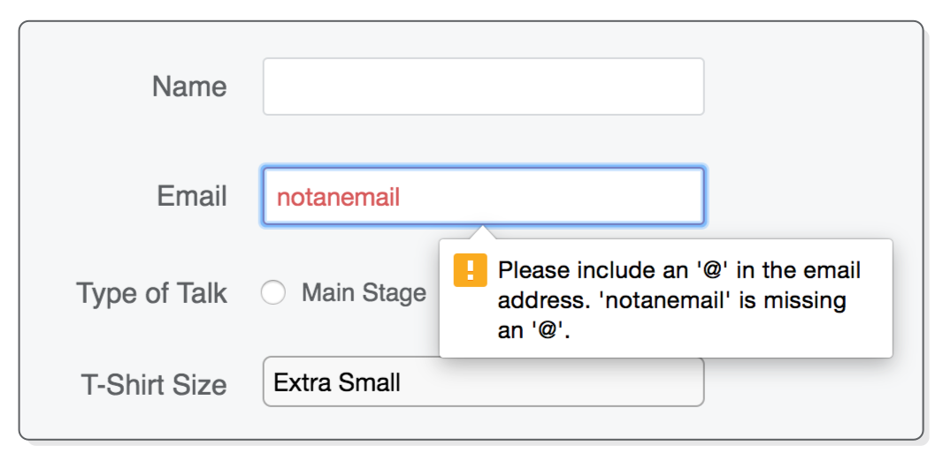
The <input/> element’s type attribute also lets you do basic input validation. For example, let’s try adding another input element that only accepts email addresses instead of arbitrary text values:
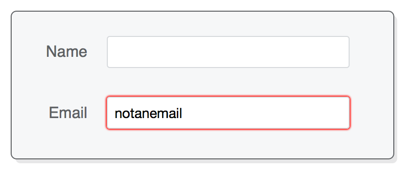
This works exactly like the type='text' input, except it automatically checks that user entered an email address. In Firefox, you can try typing something that’s not an email address, then clicking outside of the field to make it lose focus and validate its input. It should turn red to show the user that it’s an incorrect value. Chrome and Safari don’t attempt to validate until user tries to submit the form, so we’ll see this in action later in this chapter.
This is more than just validation though. By telling browsers that we’re looking for an email address, they can provide a more intuitive user experience. For instance, when a smartphone browser sees this type='email' attribute, it gives the user a special email-specific keyboard with an easily-accessible @ character.
Also notice the new placeholder attribute that lets you display some default text when the <input/> element is empty. This is a nice little UX technique to prompt the user to input their own value.
There’s a bunch of other built-in validation options besides email addresses, which you can read about on MDN’s <input/> reference. Of particular interest are the required, minlength, maxlength, and pattern attributes.
Styling Email Input Fields
We want our email field to match our text field from the previous section, so let’s add another attribute selector to the existing input[type='text'] rule, like so:
/* Change this rule */.form-rowinput[type='text'] {
background-color: #FFFFFF;
/* ... */
}
/* To have another selector */.form-rowinput[type='text'],
.form-rowinput[type='email'] {
background-color: #FFFFFF;
/* ... */
}
Again, we don’t want to use a plain old input type selector here because that would style all of our <input/> elements, including our upcoming radio buttons and checkbox. This is part of what makes styling forms tricky. Understanding the CSS to pluck out exactly the elements you want is a crucial skill.
Let’s not forget about our desktop styles. Update the corresponding input[type='text'] rule in our media query to match the following (note that we’re preparing for the next few sections with the select, and textarea selectors):
@media only screen and (min-width: 700px) {
/* ... */.form-rowinput[type='text'],
.form-rowinput[type='email'], /* Add */.form-rowselect, /* These */.form-rowtextarea { /* Selectors */width: 250px;
height: initial;
}
/* ... */
}
Since we can now have a “right” and a “wrong” input value, we should probably convey that to users. The :invalid and :validpseudo-classes let us style these states independently. For example, maybe we want to render both the border and the text with a custom shade of red when the user entered an unacceptable value. Add the following rule to our stylesheet, outside of the media query:
.form-rowinput[type='text']:invalid,
.form-rowinput[type='email']:invalid {
border: 1px solid #D55C5F;
color: #D55C5F;
box-shadow: none; /* Remove default red glow in Firefox */
}
Until we include a submit button, you’ll only be able to see this in Firefox, but you get the idea. There’s a similar pseudo-class called :focus that selects the element the user is currently filling out. This gives you a lot of control over the appearance of your forms.
Radio Buttons
Changing the type property of the <input/> element to radio transforms it into a radio button. Radio buttons are a little more complex to work with than text fields because they always operate in groups, allowing the user to choose one out of many predefined options.
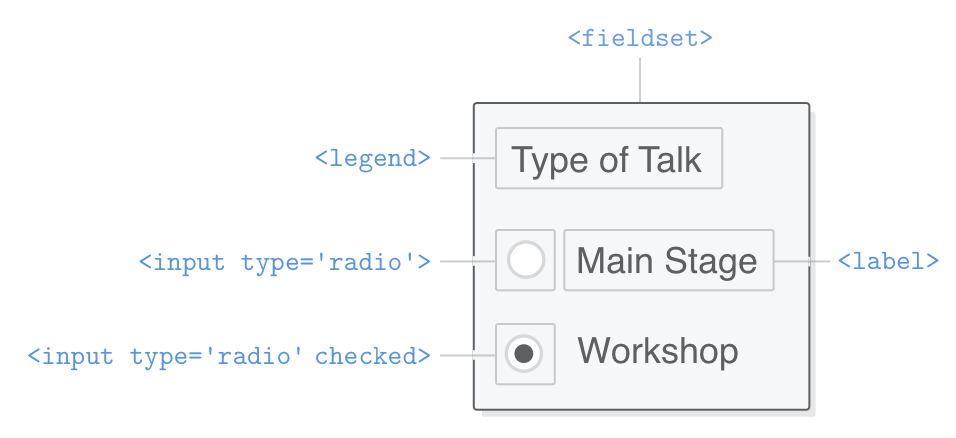
This means that we not only need a label for each <input/> element, but also a way to group radio buttons and label the entire group. This is what the <fieldset> and <legend> elements are for. Every radio button group you create should:
Be wrapped in a <fieldset>, which is labeled with a <legend>.
Associate a <label> element with each radio button.
Use the same name attribute for each radio button in the group.
Use different value attributes for each radio button.
Our radio button example has all of these components. Add the following to our <form> element underneath the email field:
<fieldsetclass='legacy-form-row'><legend>Type of Talk</legend><inputid='talk-type-1'name='talk-type'type='radio'value='main-stage' /><labelfor='talk-type-1'class='radio-label'>Main Stage</label><inputid='talk-type-2'name='talk-type'type='radio'value='workshop'checked /><labelfor='talk-type-2'class='radio-label'>Workshop</label></fieldset>
Unlike text fields, the user can’t enter custom values into a radio button, which is why each one of them needs an explicit value attribute. This is the value that will get sent to the server when the user submits the form. It’s also very important that each radio button has the same name attribute, otherwise the form wouldn’t know they were part of the same group.
We also introduced a new attribute called checked. This is a “boolean attribute”, meaning that it never takes a value—it either exists or doesn’t exist on an <input/> element. If it does exist on either a radio button or a checkbox element, that element will be selected/checked by default.
Styling Radio Buttons
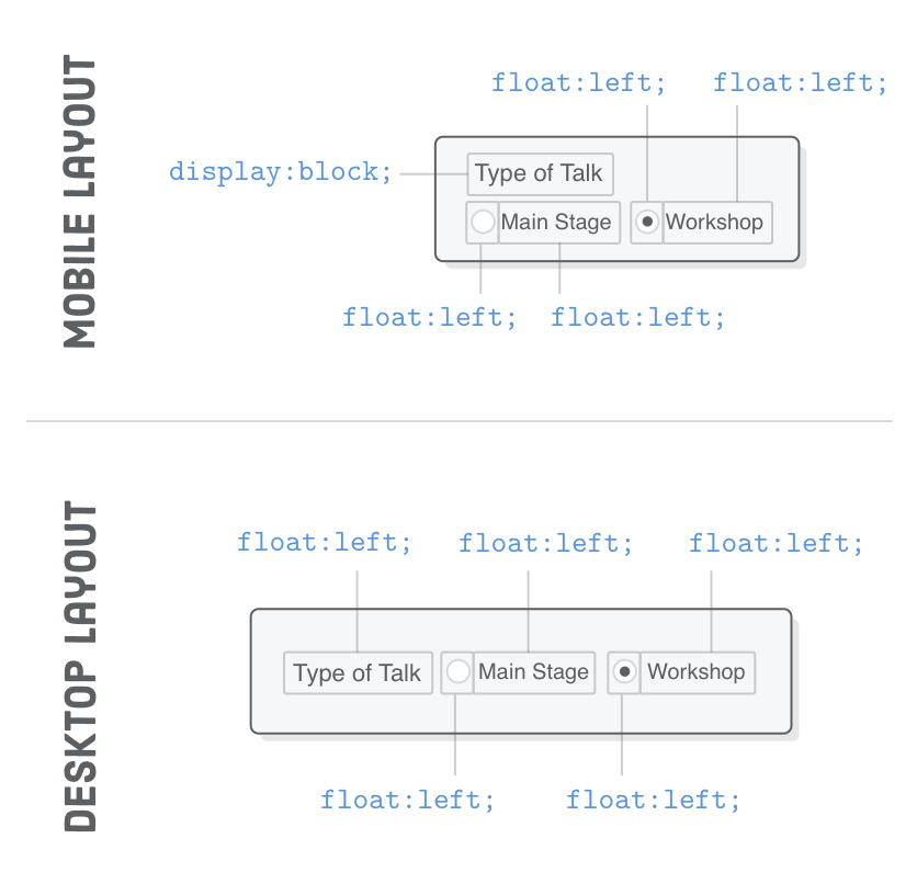
We have a few things working against us with when it comes to styling radio buttons. First, there’s simply more elements to worry about. Second, the <fieldset> and <legend> elements have rather ugly default styles, and there’s not a whole lot of consistency in these defaults across browsers. Third, at the time of this writing, <fieldset> doesn’t support flexbox.
But don’t fret! This is a good example of floats being a useful fallback for legacy/troublesome elements. You’ll notice that we didn’t wrap the radio buttons in our existing .form-row class, opting instead for a new .legacy-form-row class. This is because it’s going to be completely separate from our other elements, using floats instead of flexbox.
Start with the mobile and tablet styles by adding the following rules outside of our media query. We want to get rid of the default <fieldset> and <legend> styles, then float the radio buttons and labels so they appear in one line underneath the <legend>:
For the desktop layout, we need to make the <legend> line up with the <label> elements in the previous section (hence the width: 120px line), and we need to float everything to the left so they appear on the same line. Update our media query to include the following:
As far as layouts go, this is a pretty good cross-browser solution. However, customizing the appearance of the actual button is another story. It’s possible by taking advantage of the checked attribute, but it’s a little bit complicated. We’ll leave you to Google “custom radio button CSS” and explore that rabbit hole on your own.
Select Elements (Dropdown Menus)
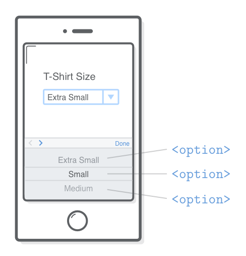
Dropdown menus offer an alternative to radio buttons, as they let the user select one out of many options. The <select> element represents the dropdown menu, and it contains a bunch of <option> elements that represent each item.
Just like our radio button <input/> elements, we have name and value attributes that get passed to the backend server. But, instead of being defined on a single element, they’re spread across the <select> and <option> elements.
Styling Select Elements
And, also just like our radio buttons, <select> elements are notoriously hard to style. However, there’s a reason for this. Dropdowns are a complex piece of interactivity, and their behavior changes significantly across devices. For instance, on an iPhone, clicking a <select> element brings up a native scrolling UI component that makes it much easier to navigate the menu.
It’s usually a good idea to let the browser/device determine the best way to preset a <select> element, so we’ll be keeping our CSS pretty simple. Unfortunately, even the simplest things are surprisingly hard. For instance, try changing the font size of our <select> element:
.form-rowselect {
width: 100%;
padding: 5px;
font-size: 14px; /* This won't work in Chrome or Safari */
}
This will work in Firefox, but not in Chrome or Safari! To sort of fix this, we can use a vendor-specific prefix for the appearance property:
.form-rowselect {
width: 100%;
padding: 5px;
font-size: 14px; /* This won't work in Chrome or Safari */-webkit-appearance: none; /* This will make it work */
}
The -webkit prefix will only apply to Chrome and Safari (which are powered by the WebKit rendering engine), while Firefox will remain unaffected. This is effectively a hack, and even MDN says not to use this CSS property.
Style difficulties like this are a serious consideration when building a form. If you need custom styles, you may be better off using radio buttons or JavaScript UI widgets. Bootstrap Dropdowns and jQuery Selectmenu’s are common JavaScript solutions for customizing select menus. In any case, at least you now understand the problem. You can read more about <select> issues here.
Textareas
The <textarea> element creates a multi-line text field designed to collect large amounts of text from the user. They’re suitable for things like biographies, essays, and comments. Go ahead and add a <textarea> to our form, along with a little piece of instructional text:
<divclass='form-row'><labelfor='abstract'>Abstract</label><textareaid='abstract'name='abstract'></textarea><divclass='instructions'>Describe your talk in 500 words or less</div></div>
Note that this isn’t self-closing like the <input/> element, so you always need a closing </textarea> tag. If you want to add any default text, it needs to go inside the tags opposed to a value attribute.
Styling Textareas
Fortunately, styling textareas is pretty straightforward. Add the following to our styles.css file (before the media query):
By default, many browsers let the user resize <textarea> elements to whatever dimensions they want. We disabled this here with the resize property.
We also need a little tweak in our desktop layout. The .instructions<div> needs to be underneath the <textarea>, so let’s nudge it left by the width of the <label> column. Add the following rule to the end of our media query:
@media only screen and (min-width: 700px) {
/* ... */.form-row.instructions {
margin-left: 120px;
}
}
Checkboxes
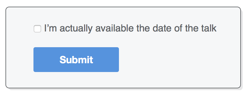
Checkboxes are sort of like radio buttons, but instead of selecting only one option, they let the user pick as many as they want. This simplifies things, since the browser doesn’t need to know which checkboxes are part of the same group. In other words, we don’t need a <fieldset> wrapper or shared name attributes. Add the following to the end of our form:
<divclass='form-row'><labelclass='checkbox-label'for='available'><inputid='available'name='available'type='checkbox'value='is-available'/><span>I’m actually available the date of the talk</span></label></div>
The way we used <label> here was a little different than previous sections. Instead of being a separate element, the <label> wraps its corresponding <input/> element. This is perfectly legal, and it’ll make it easier to match our desired layout. It’s still a best practice to use the for attribute.
Styling Checkboxes
For the mobile layout, all we need to do is override the margin-bottom that we put on the rest the <label> elements. Add the following to styles.css, outside of the media query:
.form-row.checkbox-label {
margin-bottom: 0;
}
And inside the media query, we have to take that 120-pixel label column into account:
@media only screen and (min-width: 700px) {
/* ... */.form-row.checkbox-label {
margin-left: 120px;
width: auto;
}
}
By wrapping both the checkbox and the label text, we’re able to use a width: auto to make the entire form field be on a single line (remember that the auto width makes the box match the size of its contents).
Submit Buttons
Finally, let’s finish off our form with a submit button. The <button> element represents a button that will submit its containing <form>:
Clicking the button tells the browser to validate all of the <input/> elements in the form and submit it to the action URL if there aren’t any validation problems. So, you should now be able to type in something that’s not an email address into our email field, click the <button>, and see an error message.
This also gives us a chance to see how the user’s input gets sent to the server. First, enter some values into all the <input/> fields, making sure the email address validates correctly. Then, click the button and inspect the resulting URL in your browser. You should see something like this:
Everything after the ? represents the variables in our form. Each <input/>’s name attribute is followed by an equal sign, then its value, and each variable is separated by an & character. If we had a backend server, it’d be pretty easy for it to pull out all this information, query a database (or whatever), and let us know whether the form submission was successful or not.
Styling Buttons
We had some experience styling buttons in the pseudo-classes section of the CSS Selectors chapter. Back then, we were applying these styles to an <a> element, but we can use the same techniques on a <button>.
Clean up that ugly default <button> styling by adding the following to our stylesheet:
As with our checkbox, we need to take that 120px label column into account, so include one more rule inside our media query:
@media only screen and (min-width: 700px) {
/* ... */.form-rowbutton {
margin-left: 120px;
}
}
Summary
In this chapter, we introduced the most common HTML form elements. We now have all these tools for collecting input from our website visitors:
<input type='text'/>
<input type='email'/>
<input type='radio'/>
<select> and <option>
<textarea>
<input type='checkbox'/>
<button>
You should be pretty comfortable with the HTML and CSS required to build beautiful forms, but actually making these forms functional requires some skills we don’t have yet. That stuff is out of scope for this tutorial, but it might help to have some context. Generally speaking, there are two ways to process forms:
Use the action attribute to send the form data to a backend URL, which then redirects to a success or error page. We got a little glimpse of this in the previous section, and it doesn’t require any JavaScript.
Use AJAX queries to submit the form without leaving the page. Success or error messages are displayed on the same page by manipulating the HTML with JavaScript.
Depending on how your organization is structured, form processing may not be part of your job role as a frontend web developer. If that’s the case, you’ll need to coordinate closely with a backend developer on your team to make sure the <form> submits the correct name-value pairs. Otherwise, it’ll be up to you to make sure the frontend and backend of your forms fit neatly together.
Next, we have our final chapter in HTML & CSS Is Hard. We’ll round out our frontend skills with a thorough discussion of web fonts and practical typographic principles that every web developer should know about.