The previous chapter introduced the basic text formatting properties of CSS, but that was only one aspect of styling pages. Defining the layout of a web page is an entirely different beast. That’s what this chapter is about.

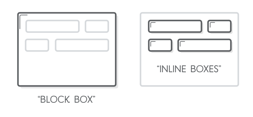
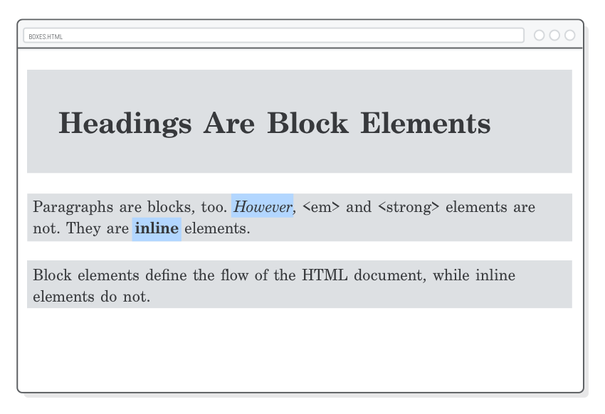
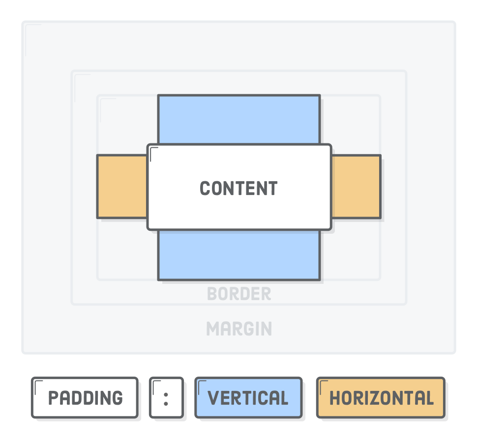
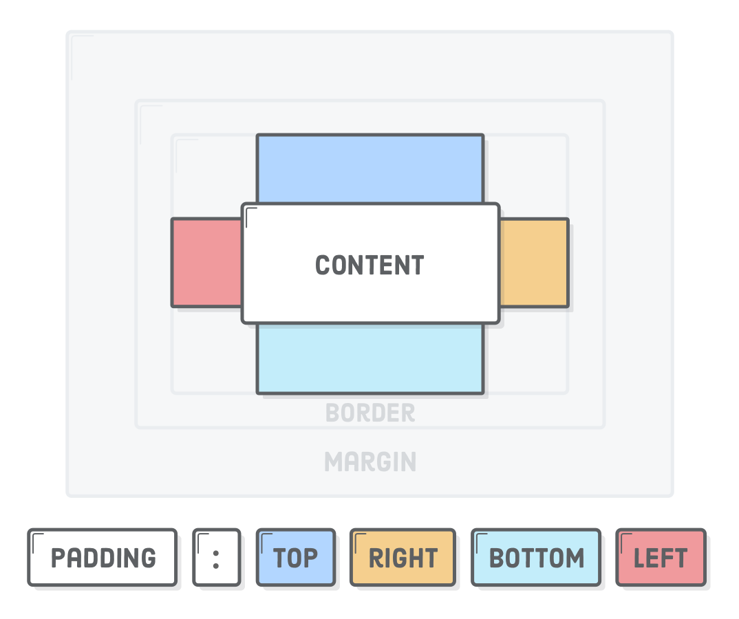
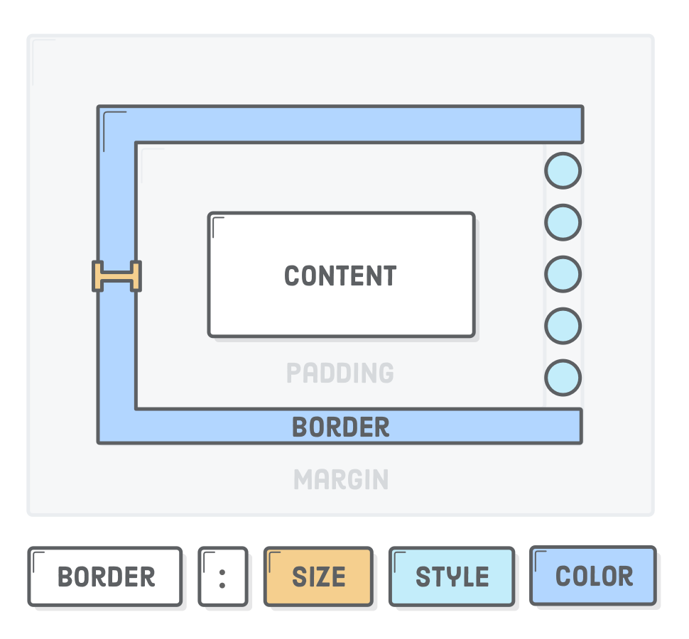
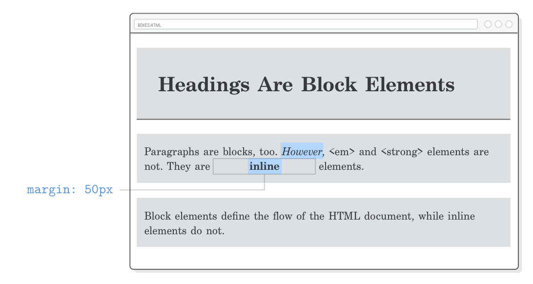
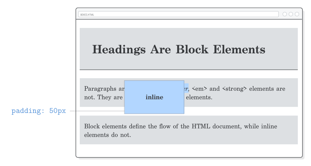
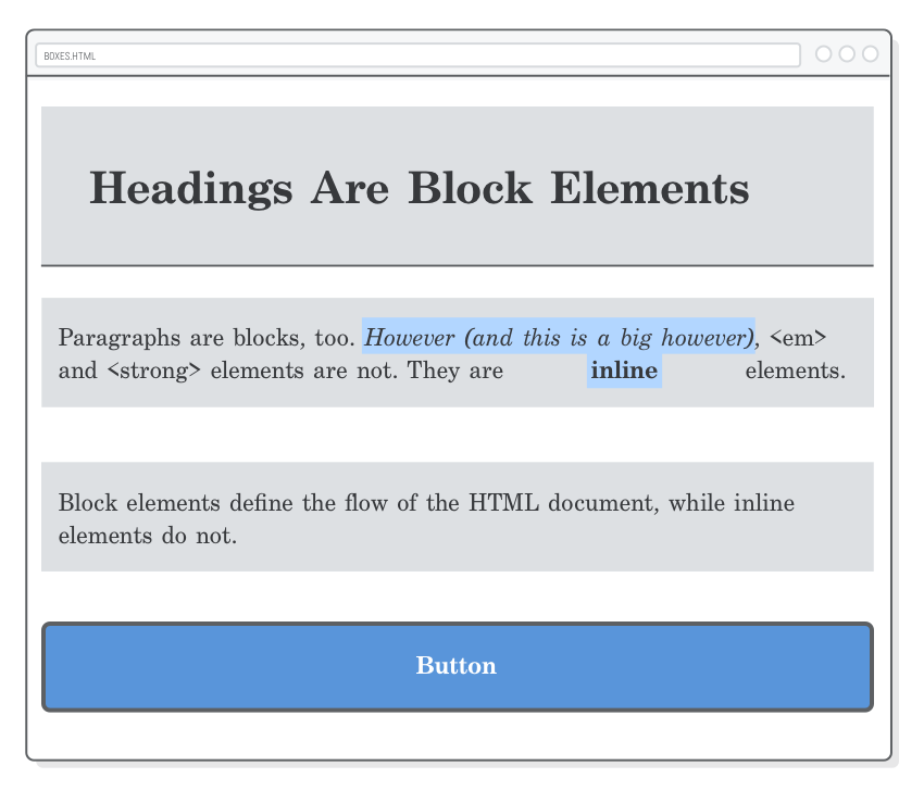
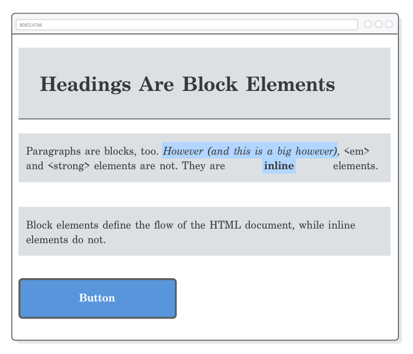
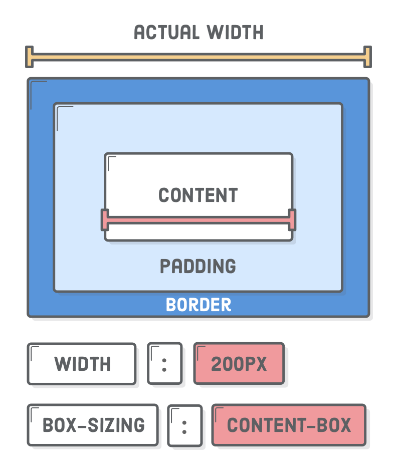
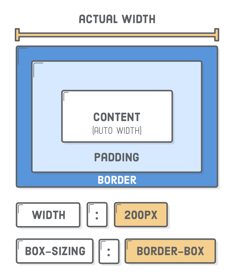
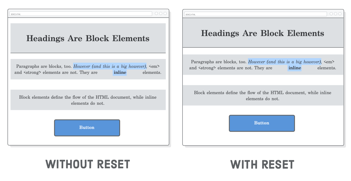
The “CSS box model“ is a set of rules that define how every web page on the Internet is rendered. CSS treats each element in your HTML document as a “box” with a bunch of different properties that determine where it appears on the page. So far, all of our web pages have just been a bunch of elements rendered one after another. The box model is our toolkit for customizing this default layout scheme.

Diagram: CSS stylesheet broken down into two parts (text formatting and the box model)

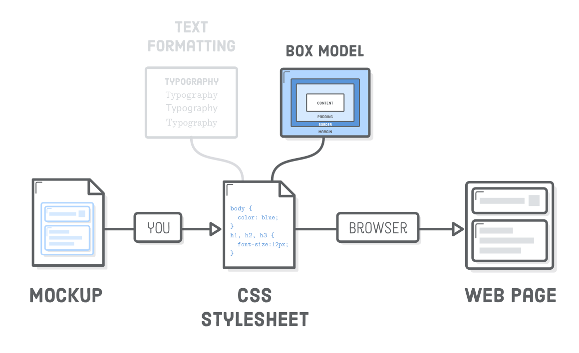
A big part of your job as a web developer will be to apply rules from the CSS box model to turn a design mockup into a web page. As you work through this chapter, you might find yourself wondering why we have to learn all these rules instead of just uploading a giant static image of a web page (i.e., a mockup) to a web server and calling it a day.

Indeed, this would make life a lot easier; however, if we didn’t separate out our content into HTML, search engines would have no way to infer the structure of our web pages, we couldn’t make our site responsive, and there would be no way to add fancy animations or interactivity with JavaScript. That’s a big enough trade-off to make CSS a worthwhile cause.

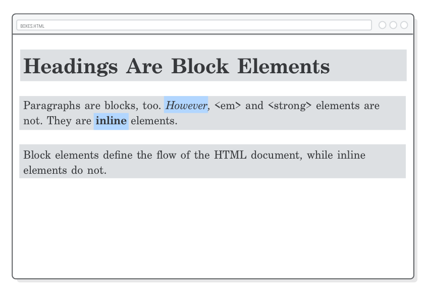
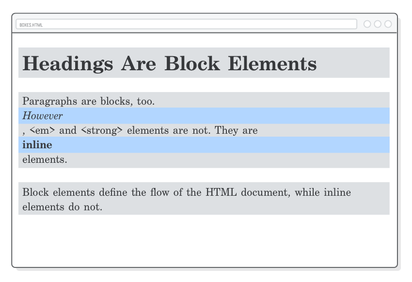
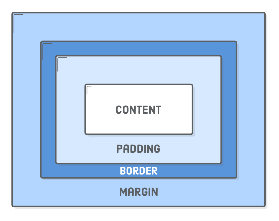
This chapter covers the core components of the CSS box model: padding, borders, margins, block boxes, and inline boxes. You can think of this as the “micro” view of CSS layouts, as it defines the individual behavior of boxes. In future chapters, we’ll learn more about how HTML structure and the CSS box model combine to form all sorts of complex page layouts.

Setup

To get started, let’s create a new folder called css-box-model and stick a new web page in it called boxes.html. Add the following code:

<!DOCTYPE html>
<html lang='en'>
  <head>
    <meta charset='UTF-8'/>
    <title>Boxes Are Easy!</title>
    <link rel='stylesheet' href='box-styles.css'/>
  </head>
  <body>
    <h1>Headings Are Block Elements</h1>

    <p>Paragraphs are blocks, too. <em>However</em>, &lt;em&gt; and &lt;strong&gt;
       elements are not. They are <strong>inline</strong> elements.</p>

    <p>Block elements define the flow of the HTML document, while inline elements
       do not.</p>
  </body>
</html>

As you should remember from Hello, CSS, this HTML file links to a CSS stylesheet stored in a file called box-styles.css. Go ahead and create this file, too (you can leave it empty for now).

Hopefully, you should be very familiar using Atom for these kinds of file and folder creation tasks. If not, be sure to review the Atom walkthrough in the introductory chapter of this tutorial.

Block Elements and
Inline Elements

Back in Basic Web Pages, we briefly touched on how CSS uses “boxes” to define the layout of a web page. Each HTML element rendered on the screen is a box, and they come in two flavors: “block” boxes and “inline“ boxes.

Diagram: comparison of block boxes with inline boxes

All the HTML elements that we’ve been working with have a default type of box. For instance, <h1> and <p> are block-level elements, while <em> and <strong> are inline elements. Let’s get a better look at our boxes by adding the following to box-styles.css:

h1, p {
  background-color: #DDE0E3;    /* Light gray */
}

em, strong {
  background-color: #B2D6FF;    /* Light blue */
}

The background-color property only fills in the background of the selected box, so this will give us a clear view into the structure of the current sample page. Our headings and paragraphs should have gray backgrounds, while our emphasis and strong elements should be light blue.

Web page highlighting block boxes in gray and inline boxes in blue

This shows us a couple of very important behaviors associated with block and inline boxes:

  • Block boxes always appear below the previous block element. This is the “natural” or “static” flow of an HTML document when it gets rendered by a web browser.

  • The width of block boxes is set automatically based on the width of its parent container. In this case, our blocks are always the width of the browser window.

  • The default height of block boxes is based on the content it contains. When you narrow the browser window, the <h1> gets split over two lines, and its height adjusts accordingly.

  • Inline boxes don’t affect vertical spacing. They’re not for determining layout—they’re for styling stuff inside of a block.

  • The width of inline boxes is based on the content it contains, not the width of the parent element.

Changing Box Behavior

We can override the default box type of HTML elements with the CSS display property. For example, if we wanted to make our <em> and <strong> elements blocks instead of inline elements, we could update our rule in box-styles.css like so:

em, strong {
  background-color: #B2D6FF;
  display: block;
}

Now, these elements act like our headings and paragraphs: they start on their own line, and they fill the entire width of the browser. This comes in handy when you’re trying to turn <a> elements into buttons or format <img/> elements (both of these are inline boxes by default).

Web page showing what happens when you turn inline boxes into block boxes with the CSS display property

However, it’s almost never a good idea to turn <em> and <strong> into block elements, so let’s turn them back into inline boxes by changing their display property to inline, like so:

em, strong {
  background-color: #B2D6FF;
  display: inline;             /* This is the default for em and strong */
}

Content, Padding, Border,
and Margin

The “CSS box model” is a set of rules that determine the dimensions of every element in a web page. It gives each box (both inline and block) four properties:

  • Content – The text, image, or other media content in the element.
  • Padding – The space between the box’s content and its border.
  • Border – The line between the box’s padding and margin.
  • Margin – The space between the box and surrounding boxes.

Together, this is everything a browser needs to render an element’s box. The content is what you author in an HTML document, and it’s the only one that has any semantic value (which is why it’s in the HTML). The rest of them are purely presentational, so they’re defined by CSS rules.

Diagram: content, padding, border, and margins making up the CSS box model

Padding

Let’s start from the inside out. We’ve already been working with content, so on to padding. The padding property…you guessed it…defines the padding for the selected element:

h1 {
  padding: 50px;
}

This adds 50 pixels to each side of the <h1> heading. Notice how the background color expands to fill this space. That’s always the case for padding because it’s inside the border, and everything inside the border gets a background.

Web page showing increase in <h1> padding (background size increases)

Sometimes you’ll only want to style one side of an element. For that, CSS provides the following properties:

p {
  padding-top: 20px;
  padding-bottom: 20px;
  padding-left: 10px;
  padding-right: 10px;
}

You can use any unit for the padding of an element, not just pixels. Again, em units are particularly useful for making your margins scale with the base font size.

Shorthand Formats

Typing out all of these properties out can be tiresome, so CSS provides an alternative “shorthand” form of the padding property that lets you set the top/bottom and left/right padding with only one line of CSS. When you provide two values to the padding property, it’s interpreted as the vertical and horizontal padding values, respectively.

Diagram: CSS padding property with vertical and horizontal values highlighted

This means that our previous rule can be rewritten as:

p {
  padding: 20px 10px;  /* Vertical  Horizontal */
}

Alternatively, if you provide four values, you can set the padding for each side of an element individually. The values are interpreted clockwise, starting at the top:

Diagram: CSS padding property with top, right, bottom, and left values highlighted

Let’s try this out by removing the 10px right padding from the previous rule. This should give us 20 pixels on the top and bottom of each paragraph, 10 pixels on the left, but none on the right:

p {
  padding: 20px 0 20px 10px;  /* Top  Right  Bottom  Left */
}

Whether or not you want to use shorthand forms or not is largely a matter of personal preference and team conventions. Some developers like the fact that the shorthand form is more condensed, while others think the long form is easier to understand at a glance (and thus easier to maintain). Regardless, you’ll likely encounter all of them at some point in your web development career.

Borders

Continuing our journey outward from the center of the CSS box model, we have the border: a line drawn around the content and padding of an element. The border property requires a new syntax that we’ve never seen before. First, we define the stroke width of the border, then its style, followed by its color.

Diagram: CSS border property showing size, style, and color syntax

Try adding a border around our <h1> heading by updating the rule in box-styles.css:

h1 {
  padding: 50px;
  border: 1px solid #5D6063;
}

This tells the browser to draw a thin gray line around our heading. Notice how the border bumps right up next to the padding with no space in between. And, if you shrink your browser enough for the heading to be split over two lines, both the padding and the border will still be there.

Drawing a border around our entire heading makes it look a little 1990s, so how about we limit it to the bottom of the heading? Like padding, there are -top, -bottom, -left, and -right variants for the border property:

border-bottom: 1px solid #5D6063;

Borders are common design elements, but they’re also invaluable for debugging. When you’re not sure how a box is being rendered, add a border: 1px solid red; declaration to it. This will clearly show the box’s padding, margin, and overall dimensions with just a single line of CSS. After you figured out why your stuff is broken, simply delete the rule.

Please refer to the Mozilla Developer Network for more information about border styles.

Margins

Margins define the space outside of an element’s border. Or, rather, the space between a box and its surrounding boxes. Let’s add some space to the bottom of each <p> element:

p {
  padding: 20px 0 20px 10px;
  margin-bottom: 50px;          /* Add this */
}

This demonstrates a side-specific variant of the margin property, but it also accepts the same shorthand formats as padding.

Margins and padding can accomplish the same thing in a lot of situations, making it difficult to determine which one is the “right” choice. The most common reasons why you would pick one over the other are:

  • The padding of a box has a background, while margins are always transparent.
  • Padding is included in the click area of an element, while margins aren’t.
  • Margins collapse vertically, while padding doesn’t (we’ll discuss this more in the next section).

If none of these help you decide whether to use padding over margin, then don’t fret about it—just pick one. In CSS, there’s often more than one way to solve your problem.

Margins on Inline Elements

One of the starkest contrasts between block-level elements and inline ones is their handling of margins. Inline boxes completely ignore the top and bottom margins of an element. For example, watch what happens when we add a big margin to our <strong> element:

strong {
  margin: 50px;
}

The horizontal margins display just like we’d expect, but this doesn’t alter the vertical space around our <strong> element one bit.

Web page demonstrating lack of vertical margins on inline boxes

If we change margin to padding, we’ll discover that this isn’t exactly the case for a box’s padding. It’ll display the blue background; however, it won’t affect the vertical layout of the surrounding boxes.

Web page demonstrating vertical padding on inline boxes

The rationale behind this goes back to the fact that inline boxes format runs of text inside of a block, and thus have limited impact on the overall layout of a page. If you want to play with the vertical space of a page, you must be working with block-level elements (luckily, we already know how to change an element’s box type).

So, before you start banging your head against the wall trying to figure out why your top or bottom margin isn’t working, remember to check your display property. Trust us, this will happen to you eventually.

Vertical Margin Collapse

Another quirk of the CSS box model is the “vertical margin collapse”. When you have two boxes with vertical margins sitting right next to each other, they will collapse. Instead of adding the margins together like you might expect, only the biggest one is displayed.

For example, let’s add a top margin of 25 pixels to our <p> element:

p {
  padding: 20px 0 20px 10px;

  margin-top: 25px;
  margin-bottom: 50px;
}

Each paragraph should have 50 pixels on the bottom, and 25 pixels on the top. That’s 75 pixels between our <p> elements, right? Wrong! There’s still only going to be 50px between them because the smaller top margin collapses into the bigger bottom one.

Diagram: comparison of an uncollapsed vertical margin with a collapsed vertical margin

This behavior can be very useful when you’re working with a lot of different kinds of elements, and you want to define their layout as the minimum space between other elements.

Preventing Margin Collapse

It can also be really annoying. Sometimes you do want to prevent the margins from collapsing. All you need to do is put another invisible element in between them:

<p>Paragraphs are blocks, too. <em>However</em>, &lt;em&gt; and &lt;strong&gt;
elements are not. They are <strong>inline</strong> elements.</p>

<div style='padding-top: 1px'></div>  <!-- Add this -->

<p>Block elements define the flow of the HTML document, while inline elements
do not.</p>

We’ll talk more about the <div> element in the next section. The important part here is that only consecutive elements can collapse into each other. Putting an element with non-zero height (hence the padding-top) between our paragraphs forces them to display both the 25px top margin and the 50px bottom margin.

Diagram: inserting an empty <div> to force vertical margins to uncollapsed

Remember that padding doesn’t ever collapse, so an alternative solution would be to use padding to space out our paragraphs instead of the margin property. However, this only works if you’re not using the padding for anything else (at the moment, we are, so let’s stick to the <div> option).

A third option to avoid margin collapse is to stick to a bottom-only or top-only margin convention. For instance, if all your elements only define a bottom margin, there’s no potential for them to collapse.

Finally, the flexbox layout scheme doesn’t have collapsing margins, so this isn’t really even an issue for modern websites.

Generic Boxes

So far, every HTML element we’ve seen lends additional meaning to the content it contains. Indeed, this is the whole point of HTML, but there are many times when we need a generic box purely for the sake of styling a web page. This is what <div> and <span> are for.

Both <div> and <span> are “container” elements that don’t have any affect on the semantic structure of an HTML document. They do, however, provide a hook for adding CSS styles to arbitrary sections of a web page. For example, sometimes you need to add an invisible box to prevent a margin collapse, or maybe you want to group the first few paragraphs of an article into a synopsis with slightly different text formatting.

We’ll use a lot of <div>’s throughout the rest of this tutorial. For now, let’s create a simple button by adding the following to the bottom of our boxes.html file:

<div>Button</div>

And here are the associated styles that need to go into box-styles.css. Most of these should be familiar from the last chapter, although we did throw in a new border-radius property:

div {
  color: #FFF;
  background-color: #5995DA;
  font-weight: bold;
  padding: 20px;
  text-align: center;
  border: 2px solid #5D6063;
  border-radius: 5px;
}

This will give us a big blue button that spans the entire width of the browser:

Web page using <div> elements for buttons

Of course, these styles also apply to the invisible <div> we used to break the margin collapse in the previous section. Obviously, we need a way to select individual <div>’s if they’re to be of any practical use to us. That’s what class selectors are for, which we’ll introduce in the next chapter. In lieu of those, let’s just delete or comment out that invisible <div>.

The only real difference between a <div> and a <span> is that the former is for block-level content while the latter is meant for inline content.

Explicit Dimensions

So far, we’ve let our HTML elements define their dimensions automatically. The paddings, borders, and margins we’ve been playing with all wrap around whatever content happens to be inside the element’s box. If you add more text to our <em> element, everything will expand to accommodate it:

Web page showing an <em> element expanding as more content is added

But, sometimes our desired layout calls for an explicit dimension, like a sidebar that’s exactly 250 pixels wide. For this, CSS provides the width and height properties. These take precedence over the default size of a box’s content.

Let’s give our button an explicit width by adding the following property to box-styles.css:

div {
  /* [Existing Declarations] */
  width: 200px;
}

Instead of being as wide as the browser window, our button is now 200 pixels, and it hugs the left side of the page:

Web page showing an explicit CSS width property on a button

Also notice that if you make the button’s title longer, it will automatically wrap to the next line, and the element will expand vertically to accommodate the new content. You can change this default behavior with the white-space and overflow properties.

Content Boxes and Border Boxes

The width and height properties only define the size of a box’s content. Its padding and border are both added on top of whatever explicit dimensions you set. This explains why you’ll get an image that’s 244 pixels wide when you take a screenshot of our button, despite the fact that it has a width: 200px declaration attached to it.

Diagram: content-box measurements adding padding and border to width of the element

Needless to say, this can be a little counterintuitive when you’re trying to lay out a page. Imagine trying to fill a 600px container with three boxes that are all width: 200px, but they don’t fit because they all have a 1px border (making their actual width 202px).

Fortunately, CSS lets you change how the width of a box is calculated via the box-sizing property. By default, it has a value of content-box, which leads to the behavior described above. Let’s see what happens when we change it to border-box:

div {
  color: #FFF;
  background-color: #5995DA;
  font-weight: bold;
  padding: 20px;
  text-align: center;
  border: 2px solid #5D6063;
  border-radius: 5px;
  
  width: 200px;
  box-sizing: border-box;  /* Add this */
}

This forces the actual width of the box to be 200px—including padding and borders. Of course, this means that the content width is now determined automatically:

Diagram: border-box measurements including padding and border with the width of the element

This is much more intuitive, and as a result, using border-box for all your boxes is considered a best practice among modern web developers.

Aligning Boxes

Aligning boxes horizontally is a common task for web developers, and the box model offers a lot of ways to do it. We already saw the text-align property, which aligns the content and inline boxes inside of a block-level element. Aligning block boxes is another story.

Try adding the following rule to our stylesheet. It will only align the content inside of our block boxes—not the blocks themselves. Our <div> button is still left-aligned regardless of the <body>’s text alignment:

body {
  text-align: center;
}

There are three methods for horizontally aligning block-level elements: “auto-margins” for center alignment, “floats” for left/right alignment, and “flexbox” for complete control over alignment. Yes, unfortunately block-level alignment is totally unrelated to the text-align property.

Centering With Auto-Margins

Floats and flexbox are complicated topics that we’ve devoted entire chapters to, but we do have the background to deal with auto-margins right now. When you set the left and right margin of a block-level element to auto, it will center the block in its parent element.

For example, we can center our button with the following:

div {
  color: #FFF;
  background-color: #4A90E2;
  font-weight: bold;
  padding: 20px;
  text-align: center;

  width: 200px;
  box-sizing: border-box;
  margin: 20px auto; /* Vertical  Horizontal */
}

Note that this only works on blocks that have an explicit width defined on them. Remove that width: 200px line, and our button will be the full width of the browser, making “center alignment” meaningless.

Resetting Styles

Notice that white band around our page? That’s a default margin/padding added by your browser. Different browsers have different default styles for all of their HTML elements, making it difficult to create consistent stylesheets.

One web page showing white border due to default margin/padding and another web page without the white border after a universal reset

It’s usually a good idea to override default styles to a predictable value using the “universal” CSS selector (*). Try adding this to the top of our box-styles.css file:

* {
  margin: 0;
  padding: 0;
  box-sizing: border-box;
}

This selector matches every HTML element, effectively resetting the margin and padding properties for our web page. We also converted all our boxes to border-box, which, again, is a best practice.

You’ll find a similar reset at the top of almost every global CSS stylesheet on the web. They can get a whole lot more complicated, but the three simple declarations shown above allow us to confidently tweak the CSS box model for our own purposes without worrying about unforeseen interactions with default browser styles.

Summary

We’ll learn more about the practical uses of the CSS box model as we get deeper into constructing complex web pages. For now, think of it as a new tool in your CSS toolbox. With a few key concepts from this chapter, you should feel much more equipped to convert a design mockup into a real-life web page:

  • Everything is a box.
  • Boxes can be inline or block-level.
  • Boxes have content, padding, borders, and margins.
  • They also have seemingly arbitrary rules about how they interact.
  • Mastering the CSS box model means you can lay out most web pages.

Like the last chapter, the CSS properties we just covered might seem simple—and they sort of are. But, start looking at the websites you visit through the lens of the CSS box model, and you’ll see this stuff literally everywhere.

Our exploration of generic boxes (<div> and <span>) was a little bit limited because we didn’t have a way to pluck out an individual HTML element from our web page. We’ll fix that in the next chapter with a more in-depth discussion of CSS selectors.