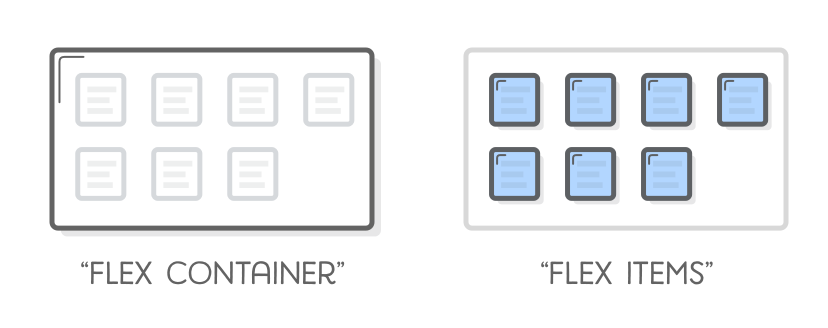
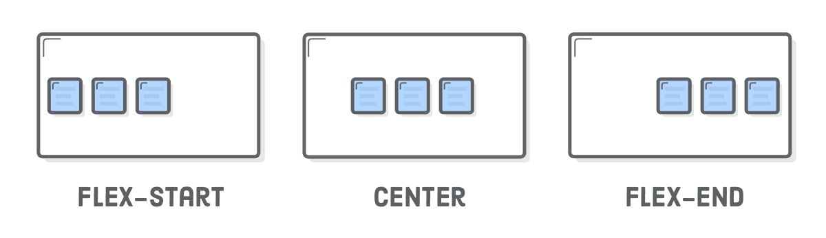
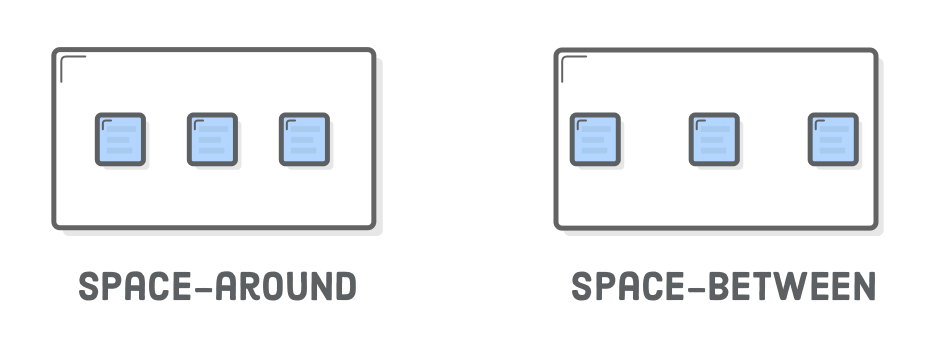
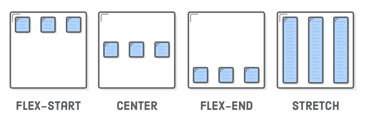
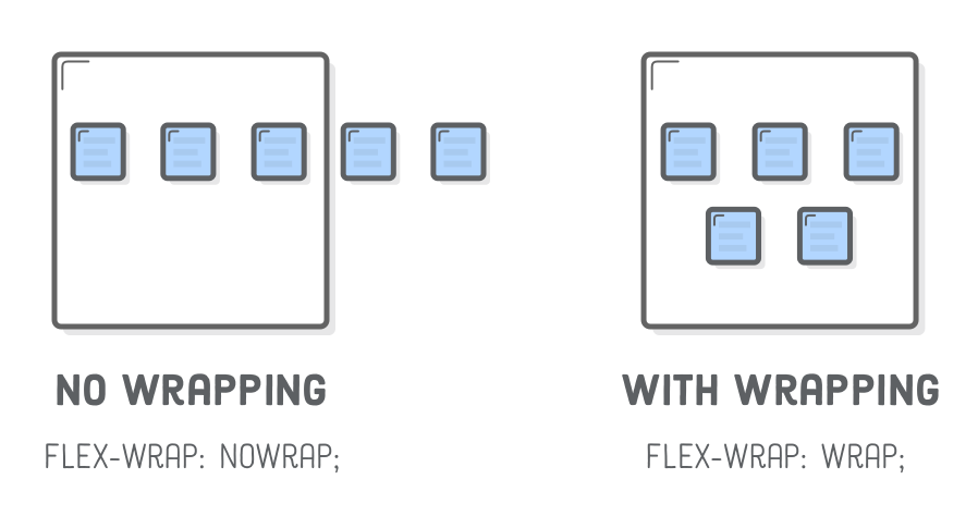
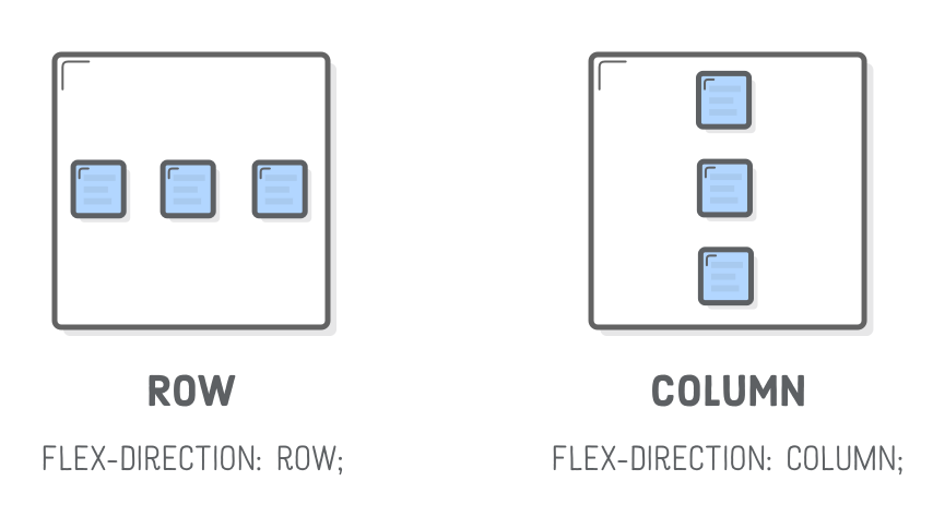
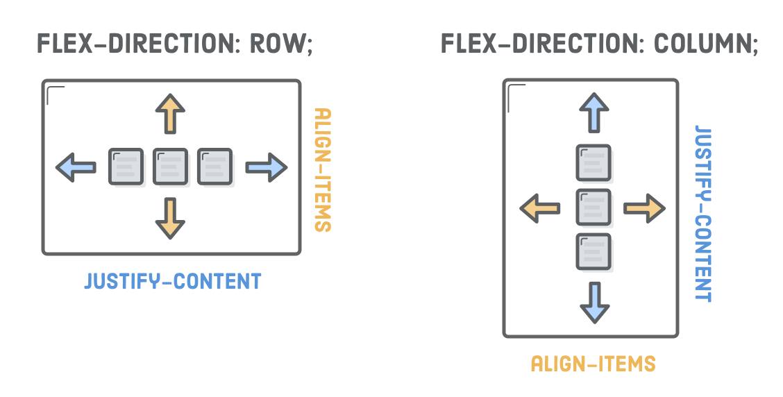
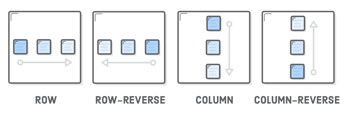
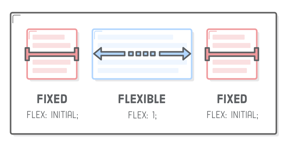
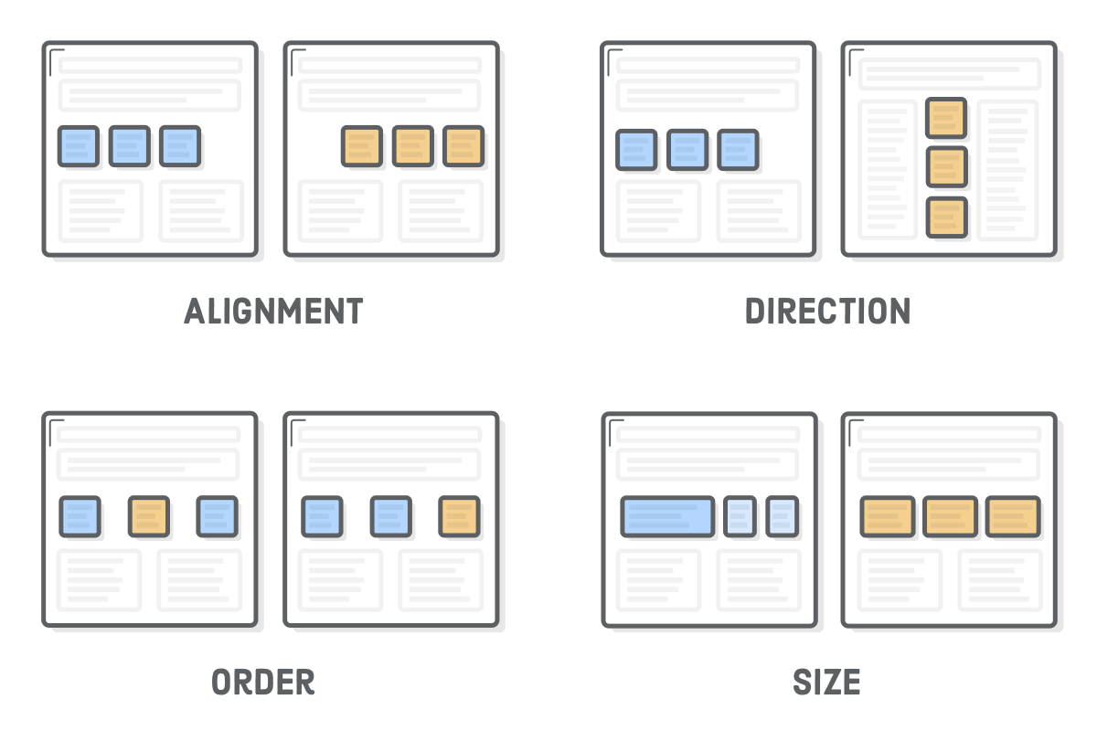
The “Flexible Box” or “Flexbox” layout mode offers an alternative to Floats for defining the overall appearance of a web page. Whereas floats only let us horizontally position our boxes, flexbox gives us complete control over the alignment, direction, order, and size of our boxes.

Diagram: comparison of flexbox alignment, direction, order, and size properties

The web is currently undergoing a major transition, so a little discussion around the state of the industry is warranted. For the last decade or so, floats were the sole option for laying out a complex web page. As a result, they’re well supported even in legacy browsers, and developers have used them to build millions of web pages. This means you’ll inevitably run into floats during your web development career (so the previous chapter wasn’t a total waste).

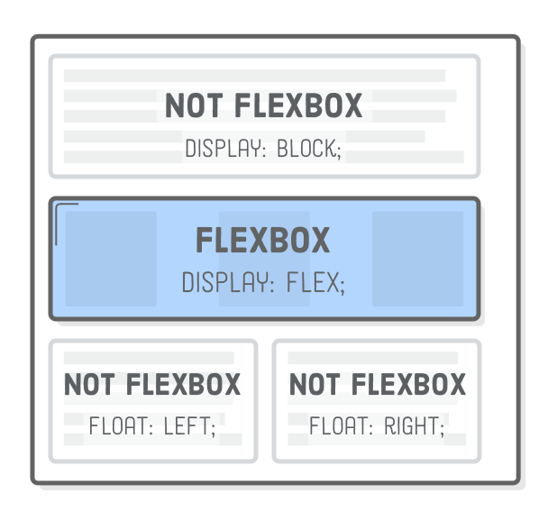
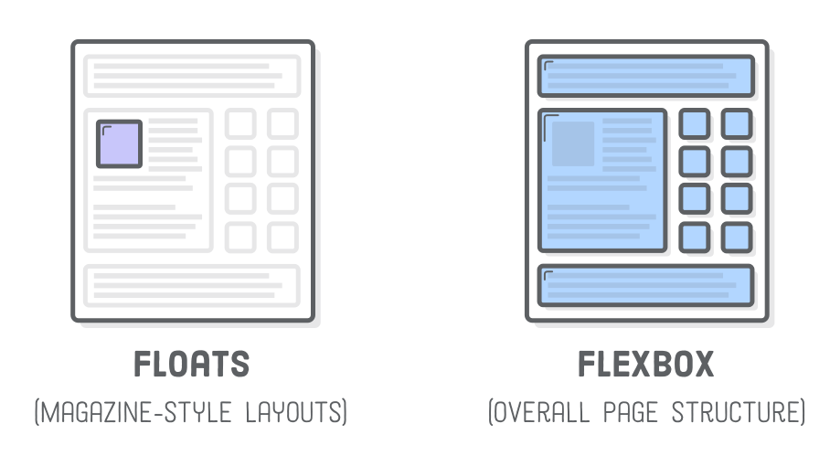
However, floats were originally intended for the magazine-style layouts that we covered in Floats for Content. Despite what we saw last chapter, the kinds of layouts you can create with floats are actually somewhat limited. Even a simple sidebar layout is, technically speaking, a little bit of a hack. Flexbox was invented to break out of these limitations.

We’re finally at a point where browser support has hit critical mass and developers can start building full websites with flexbox. Our recommendation is to use flexbox to lay out your web pages as much as possible, reserving floats for when you need text to flow around a box (i.e., a magazine-style layout) or when you need to support legacy web browsers.

Diagram: CSS floats for text wrapping around a box versus flexbox for the rest of the page layout

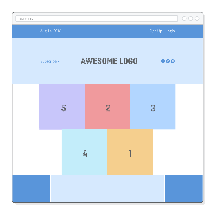
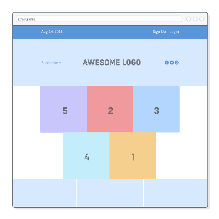
In this chapter, we’ll explore the entire flexbox layout model step by step. You should walk away comfortable building virtually any layout a web designer could ever give you.

Setup

The example for this chapter is relatively simple, but it clearly demonstrates all of the important flexbox properties. We’ll wind up with something that looks like this:

Web page with flexbox-based layout

For starters, we need an empty HTML document that contains nothing but a menu bar. Make a new Atom project called flexbox to house all the example files for this chapter. Then, create flexbox.html and add the following markup:

<!DOCTYPE html>
<html lang='en'>
  <head>
    <meta charset='UTF-8'/>
    <title>Some Web Page</title>
    <link rel='stylesheet' href='styles.css'/>
  </head>
  <body>
    <div class='menu-container'>
      <div class='menu'>
        <div class='date'>Aug 14, 2016</div>
        <div class='signup'>Sign Up</div>
        <div class='login'>Login</div>
      </div>
    </div>
  </body>
</html>

Next, we need to create the corresponding styles.css stylesheet. This won’t look like much: just a full-width blue menu bar with a white-bordered box in it. Note that we’ll be using flexbox instead of our traditional auto-margin technique to center the menu.

* {
  margin: 0;
  padding: 0;
  box-sizing: border-box;
}

.menu-container {
  color: #fff;
  background-color: #5995DA;  /* Blue */
  padding: 20px 0;
}

.menu {
  border: 1px solid #fff;  /* For debugging */
  width: 900px;
}

Finally, download some images for use by our example web page. Unzip them into the flexbox project, keeping the parent images directory. Your project should look like this before moving on:

Screenshot of project files

Flexbox Overview

Flexbox uses two types of boxes that we’ve never seen before: “flex containers” and “flex items”. The job of a flex container is to group a bunch of flex items together and define how they’re positioned.

Diagram: flex container as a highlighted container wrapping grayed out elements versus flex items as highlighted boxes inside the container

Every HTML element that’s a direct child of a flex container is an “item”. Flex items can be manipulated individually, but for the most part, it’s up to the container to determine their layout. The main purpose of flex items are to let their container know how many things it needs to position.

As with float-based layouts, defining complex web pages with flexbox is all about nesting boxes. You align a bunch of flex items inside a container, and, in turn, those items can serve as flex containers for their own items. As you work through the examples in this chapter, remember that the fundamental task of laying out a page hasn’t changed: we’re still just moving a bunch of nested boxes around.

Flex Containers

The first step in using flexbox is to turn one of our HTML elements into a flex container. We do this with the display property, which should be familiar from the CSS Box Model chapter. By giving it a value of flex, we’re telling the browser that everything in the box should be rendered with flexbox instead of the default box model.

Add the following line to our .menu-container rule to turn it into a flex container:

.menu-container {
  /* ... */
  display: flex;
}

This enables the flexbox layout mode—without it, the browser would ignore all the flexbox properties that we’re about to introduce. Explicitly defining flex containers means that you can mix and match flexbox with other layout models (e.g., floats and everything we’re going to learn in Advanced Positioning).

Diagram: Mixing and matching flexbox layout with block boxes and floats

Great! We have a flex container with one flex item in it. However, our page will look exactly like it did before because we haven’t told the container how to display its item.

Aligning a Flex Item

After you’ve got a flex container, your next job is to define the horizontal alignment of its items. That’s what the justify-content property is for. We can use it to center our .menu, like so:

.menu-container {
  /* ... */
  display: flex;
  justify-content: center;    /* Add this */
}

This has the same effect as adding a margin: 0 auto declaration to the .menu element. But, notice how we did this by adding a property to the parent element (the flex container) instead of directly to the element we wanted to center (the flex item). Manipulating items through their containers like this is a common theme in flexbox, and it’s a bit of a divergence from how we’ve been positioning boxes thus far.

Diagram: flex-start (3 left-aligned boxes), center (3 center-aligned boxes), flex-end (3 right-aligned boxes)

Other values for justify-content are shown below:

  • center
  • flex-start
  • flex-end
  • space-around
  • space-between

Try changing justify-content to flex-start and flex-end. This should align the menu to the left and right side of the browser window, respectively. Be sure to change it back to center before moving on. The last two options are only useful when you have multiple flex items in a container.

Distributing Multiple Flex Items

“Big deal,” you might be saying: we can do left/right alignment with floats and centering with auto-margins. True. Flexbox doesn’t show its real strength until we have more than one item in a container. The justify-content property also lets you distribute items equally inside a container.

Diagram: space-around (3 boxes with equal space between them and their container), space-between (3 boxes with spaces between them, but not between their container)

Change our .menu rule to match the following:

.menu {
  border: 1px solid #fff;
  width: 900px;
  display: flex;
  justify-content: space-around;
}

This turns our .menu into a nested flex container, and the space-around value spreads its items out across its entire width. You should see something like this:

Web page showing menu bar <li> elements laid out with space-between

The flex container automatically distributes extra horizontal space to either side of each item. The space-between value is similar, but it only adds that extra space between items. This is what we actually want for our example page, so go ahead and update the justify-content line:

justify-content: space-between;

Of course, you can also use center, flex-start, flex-end here if you want to push all the items to one side or another, but let’s leave it as space-between.

Grouping Flex Items

Flex containers only know how to position elements that are one level deep (i.e., their child elements). They don’t care one bit about what’s inside their flex items. This means that grouping flex items is another weapon in your layout-creation arsenal. Wrapping a bunch of items in an extra <div> results in a totally different web page.

Diagram: wrapping two flex items in a <div> to eliminate one of the flex items

For example, let’s say you want both the Sign Up and Login links to be on the right side of the page, as in the screenshot below. All we need to do is stick them in another <div>:

<div class='menu'>
  <div class='date'>Aug 14, 2016</div>
  <div class='links'>
    <div class='signup'>Sign Up</div>      <!-- This is nested now -->
    <div class='login'>Login</div>         <!-- This one too! -->
  </div>
</div>

Instead of having three items, our .menu flex container now has only two (.date and .links). Under the existing space-between behavior, they’ll snap to the left and right side of the page.

Web page showing two menu bar <li> items wrapped in a container <div>

But, now we need to lay out the .links element because it’s using the default block layout mode. The solution: more nested flex containers! Add a new rule to our styles.css file that turns the .links element into a flex container:

.links {
  border: 1px solid #fff;  /* For debugging */
  display: flex;
  justify-content: flex-end;
}

.login {
  margin-left: 20px;
}

This will put our links right where we want them. Notice that margins still work just like they did in the CSS Box Model. And, as with the normal box model, auto margins have a special meaning in flexbox (we’ll leave that for the end of the chapter though).

Web page <li> elements laid out with nested flexbox containers

We won’t need those white borders anymore, so you can go ahead and delete them if you like.

Cross-Axis (Vertical) Alignment

So far, we’ve been manipulating horizontal alignment, but flex containers can also define the vertical alignment of their items. This is something that’s simply not possible with floats.

Diagram: justify-content (left and right), align-items (top and bottom)

To explore this, we need to add a header underneath our menu. Add the following markup to flexbox.html after the .menu-container element:

<div class='header-container'>
  <div class='header'>
    <div class='subscribe'>Subscribe &#9662;</div>
    <div class='logo'><img src='images/awesome-logo.svg'/></div>
    <div class='social'><img src='images/social-icons.svg'/></div>
  </div>
</div>

Next, add some base styles to get it aligned with our .menu element:

.header-container {
  color: #5995DA;
  background-color: #D6E9FE;
  display: flex;
  justify-content: center;
}

.header {
  width: 900px;
  height: 300px;
  display: flex;
  justify-content: space-between;
}

This should all be familiar; however, the scenario is a little bit different than our menu. Since .header has an explicit height, items can be positioned vertically inside of it. The official specification calls this “cross-axis” alignment (we’ll see why in a moment), but for our purposes it might as well be called “vertical” alignment.

Web page showing heading and icons vertically centered in a header container via the align-items property

Vertical alignment is defined by adding an align-items property to a flex container. Make our example page match the above screenshot with the following line:

.header {
  /* ... */
  align-items: center;  /* Add this */
}

The available options for align-items is similar to justify-content:

  • center
  • flex-start   (top)
  • flex-end      (bottom)
  • stretch
  • baseline
Diagram: flex-start (boxes at top of container), center (boxes in center of container), flex-end (boxes at bottom of container, stretch (boxes filling height of container)

Most of these are pretty straightforward. The stretch option is worth a taking a minute to play with because it lets you display the background of each element. Let’s take a brief look by adding the following to styles.css:

.header {
  /* ... */
  align-items: stretch;    /* Change this */
}

.social,
.logo,
.subscribe {
  border: 1px solid #5995DA;
}

The box for each item extends the full height of the flex container, regardless of how much content it contains. A common use case for this behavior is creating equal-height columns with a variable amount of content in each one—something very difficult to do with floats.

Be sure to delete the above changes and vertically center our content inside of .header before moving on.

Wrapping Flex Items

Flexbox is a more powerful alternative to float-based grids. Not only can it render items as a grid—it can change their alignment, direction, order, and size, too. To create a grid, we need the flex-wrap property.

Diagram: no wrapping (boxes flowing outside of container), with wrapping (boxes wrapping to next line in container)

Add a row of photos to flexbox.html so that we have something to work with. This should go inside of <body>, under the .header-container element:

<div class='photo-grid-container'>
  <div class='photo-grid'>
    <div class='photo-grid-item first-item'>
      <img src='images/one.svg'/>
    </div>
    <div class='photo-grid-item'>
      <img src='images/two.svg'/>
    </div>
    <div class='photo-grid-item'>
      <img src='images/three.svg'/>
    </div>
  </div>
</div>

Again, the corresponding CSS should be familiar from previous sections:

.photo-grid-container {
  display: flex;
  justify-content: center;
}

.photo-grid {
  width: 900px;
  display: flex;
  justify-content: flex-start;
}

.photo-grid-item {
  border: 1px solid #fff;
  width: 300px;
  height: 300px;
}

This should work as expected, but watch what happens when we add more items than can fit into the flex container. Insert an extra two photos into the .photo-grid:

<div class='photo-grid-item'>
  <img src='images/four.svg'/>
</div>
<div class='photo-grid-item last-item'>
  <img src='images/five.svg'/>
</div>

By default, they flow off the edge of the page:

Web page with messed up layout due to no flexbox wrapping

If you’re trying to build a hero banner that lets the user horizontally scroll through a bunch of photos, this might be desired behavior, but that’s not what we want. Adding the following flex-wrap property forces items that don’t fit to get bumped down to the next row:

.photo-grid {
  /* ... */
  flex-wrap: wrap;
}

Now, our flex items behave much like floated boxes, except flexbox gives us more control over how “extra” items are aligned in the final row via the justify-content property. For example, the last line is currently left-aligned. Try centering it by updating our .photo-grid rule, like so:

.photo-grid {
  width: 900px;
  display: flex;
  justify-content: center;    /* Change this */
  flex-wrap: wrap;
}

Achieving this with float-based layouts is ridiculously complicated.

Web page showing grid created from correct flexbox wrapping

Flex Container Direction

“Direction” refers to whether a container renders its items horizontally or vertically. So far, all the containers we’ve seen use the default horizontal direction, which means items are drawn one after another in the same row before popping down to the next column when they run out of space.

Diagram: row (3 horizontal boxes), column (3 vertical boxes)

One of the most amazing things about flexbox is its ability to transform rows into columns using only a single line of CSS. Try adding the following flex-direction declaration to our .photo-grid rule:

.photo-grid {
  /* ... */
  flex-direction: column;
}

This changes the direction of the container from the default row value. Instead of a grid, our page now has a single vertical column:

Web page with grid turned into a vertical column of boxes

A key tenant of responsive design is presenting the same HTML markup to both mobile and desktop users. This presents a bit of a problem, as most mobile layouts are a single column, while most desktop layouts stack elements horizontally. You can imagine how useful flex-direction is going to become once we start building responsive layouts.

Alignment Considerations

Notice that the column is hugging the left side of its flex container despite our justify-content: center; declaration. When you rotate the direction of a container, you also rotate the direction of the justify-content property. It now refers to the container’s vertical alignment—not its horizontal alignment.

Diagram: axes flipped when flex-direction is equal to column

To horizontally center our column, we need to define an align-items property on our .photo-grid:

.photo-grid {
  /* ... */
  flex-direction: column;
  align-items: center;      /* Add this */
}

Flex Container Order

Up until now, there’s been a tight correlation between the order of our HTML elements and the way boxes are rendered in a web page. With either floats or the flexbox techniques we’ve seen so far, the only way we could make a box appear before or after another one is to move around the underlying HTML markup. That’s about to change.

Diagram: row (left to right), row-reverse (right to left), column (top to bottom), column-reverse (bottom to top)

The flex-direction property also offers you control over the order in which items appear via the row-reverse and column-reverse properties. To see this in action, let’s transform our column back into a grid, but this time around we’ll reverse the order of everything:

.photo-grid {
  width: 900px;
  display: flex;
  justify-content: center;
  flex-wrap: wrap;
  flex-direction: row-reverse;  /* <--- Really freaking cool! */
  align-items: center;
}

Both rows are now rendered right-to-left instead of left-to-right. But, notice how this only swaps the order on a per-row basis: the first row doesn’t start at 5, it starts at 3. This is useful behavior for a lot of common design patterns (column-reverse in particular opens up a lot of doors for mobile layouts). We’ll learn how to get even more granular in the next section.

Web page with grid rows displayed backwards (3, 2, 1 in first row and 5, 4 in second row)

Reordering elements from inside a stylesheet is a big deal. Before flexbox, web developers had to resort to JavaScript hacks to accomplish this kind of thing. However, don’t abuse your newfound abilities. As we discussed in the very first chapter of this tutorial, you should always separate content from presentation. Changing the order like this is purely presentational—your HTML should still make sense without these styles applied to it.

Flex Item Order

This entire chapter has been about positioning flex items through their parent containers, but it’s also possible to manipulate individual items. The rest of this chapter is going to shift focus away from flex containers onto the items they contain.

Diagram: setting the order of a flex item individual with the order property

Adding an order property to a flex item defines its order in the container without affecting surrounding items. Its default value is 0, and increasing or decreasing it from there moves the item to the right or left, respectively.

This can be used, for example, to swap order of the .first-item and .last-item elements in our grid. We should also change the row-reverse value from the previous section back to row because it’ll make our edits a little easier to see:

.photo-grid {
  /* ... */
  flex-direction: row;  /* Update this */
  align-items: center;
}

.first-item {
  order: 1;
}

.last-item {
  order: -1;
}

Unlike setting row-reverse and column-reverse on a flex container, order works across row/column boundaries. The above snippet will switch our first and last items, even though they appear on different rows.

Flex Item Alignment

We can do the same thing with vertical alignment. What if we want that Subscribe link and those social icons to go at the bottom of the header instead of the center? Align them individually! This is where the align-self property comes in. Adding this to a flex item overrides the align-items value from its container:

.social,
.subscribe {
  align-self: flex-end;
  margin-bottom: 20px;
}

This should send them to the bottom of the .header. Note that margins (padding, too) work just like you’d expect.

Web page showing bottom-aligned icons via the align-self property

You can align elements in other ways using the same values as the align-items property, listed below for convenience.

  • center
  • flex-start   (top)
  • flex-end      (bottom)
  • stretch
  • baseline

Flexible Items

All our examples have revolved around items with fixed- or content-defined-widths. This has let us focus on the positioning aspects of flexbox, but it also means we’ve been ignoring its eponymous “flexible box” nature. Flex items are flexible: they can shrink and stretch to match the width of their containers.

The flex property defines the width of individual items in a flex container. Or, more accurately, it allows them to have flexible widths. It works as a weight that tells the flex container how to distribute extra space to each item. For example, an item with a flex value of 2 will grow twice as fast as items with the default value of 1.

Diagram: no flex (3 square boxes), equal flex (3 rectangle boxes), unequal flex (2 smaller boxes, one stretched out box)

First, we need a footer to experiment with. Stick this after the .photo-grid-container element:

<div class='footer'>
  <div class='footer-item footer-one'></div>
  <div class='footer-item footer-two'></div>
  <div class='footer-item footer-three'></div>
</div>

Then, some CSS:

.footer {
  display: flex;
  justify-content: space-between;
}

.footer-item {
  border: 1px solid #fff;
  background-color: #D6E9FE;
  height: 200px;
  flex: 1;
}

That flex: 1; line tells the items to stretch to match the width of .footer. Since they all have the same weight, they’ll stretch equally:

Web page with three equal boxes that stretch to fill the footer

Increasing the weight of one of the items makes it grow faster than the others. For example, we can make the third item grow twice as fast as the other two with the following rule:

.footer-three {
  flex: 2;
}

Compare this to the justify-content property, which distributes extra space between items. This is similar, but now we’re distributing that space into the items themselves. The result is full control over how flex items fit into their containers.

Static Item Widths

We can even mix-and-match flexible boxes with fixed-width ones. flex: initial falls back to the item’s explicit width property. This lets us combine static and flexible boxes in complex ways.

Diagram: fixed-width box (flex: initial), flexible box (flex: 1)

We’re going to make our footer behave like the above diagram. The center item is flexible, but the ones on either side are always the same size. All we need to do is add the following rule to our stylesheet:

.footer-one,
.footer-three {
  background-color: #5995DA;
  flex: initial;
  width: 300px;
}

Without that flex: initial; line, the flex: 1; declaration would be inherited from the .footer-item rule, causing the width properties to be ignored. initial fixes this, and we get a flexible layout that also contains fixed-width items. When you resize the browser window, you’ll see that only the middle box in the footer gets resized.

Web page with two static-width boxes on either side of a flexible box stretching to fill the footer

This is a pretty common layout, and not just in footers, either. For instance, many websites have a fixed-width sidebar (or multiple sidebars) and a flexible content block containing the main text of the page. This is basically a taller version of the footer we just created.

Flex Items and Auto-Margins

Auto-margins in flexbox are special. They can be used as an alternative to an extra <div> when trying to align a group of items to the left/right of a container. Think of auto-margins as a “divider” for flex items in the same container.

Let’s take a look by flattening our items in .menu so that it matches the following:

<div class='menu-container'>
  <div class='menu'>
    <div class='date'>Aug 14, 2016</div>
    <div class='signup'>Sign Up</div>
    <div class='login'>Login</div>
  </div>
</div>

Reloading the page should make the items spread out equally through our menu, just like at the beginning of the chapter. We can replicate the desired layout by sticking an auto-margin between the items we want to separate, like so:

.signup {
  margin-left: auto;
}

Auto-margins eat up all the extra space in a flex container, so instead of distributing items equally, this moves the .signup and any following items (.login) to the right side of the container. This will give you the exact same layout we had before, but without that extra nested <div> to group them. Sometimes, it’s nice to keep your HTML flatter.

Summary

Flexbox gave us a ton of amazing new tools for laying out a web page. Compare these techniques to what we were able to do with floats, and it should be pretty clear that flexbox is a cleaner option for laying out modern websites:

  • Use display: flex; to create a flex container.
  • Use justify-content to define the horizontal alignment of items.
  • Use align-items to define the vertical alignment of items.
  • Use flex-direction if you need columns instead of rows.
  • Use the row-reverse or column-reverse values to flip item order.
  • Use order to customize the order of individual elements.
  • Use align-self to vertically align individual items.
  • Use flex to create flexible boxes that can stretch and shrink.

Remember that these flexbox properties are just a language that lets you tell browsers how to arrange a bunch of HTML elements. The hard part isn’t actually writing the HTML and CSS code, it’s figuring out, conceptually (on a piece of paper), the behavior of all the necessary boxes to create a given layout.

When a designer hands you a mockup to implement, your first task is to draw a bunch of boxes on it and determine how they’re supposed to stack, stretch, and shrink to achieve the desired design. Once you’ve got that done, it should be pretty easy to code it up using these new flexbox techniques.

The flexbox layout mode should be used for most of your web pages, but there are some things it’s not-so-good at, like gently tweaking element positions and preventing them from interacting with the rest of the page. After covering these kinds of advanced positioning techniques in the next chapter, you’ll be an HTML and CSS positioning expert.