A friendly tutorial about static, relative, absolute, and fixed positioning
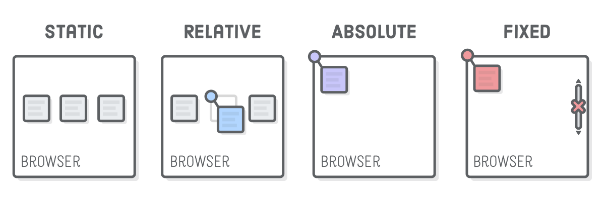
“Static positioning” refers to the normal flow of the page that we’ve been working with up ’til this point. The CSS Box Model, floats, and flexbox layout schemes all operate in this “static” flow, but that’s not the only positioning scheme available in CSS.
The other three types of positioning are “relative”, “absolute”, and “fixed”. Each of them let you manually position elements using specific coordinates, opposed to the more semantic options in flexbox and floats. Instead of saying “Stick this box in the center of its container,” advanced positioning lets you say things like “Put that box 20 pixels above and 50 pixels to the right of its parent’s origin.”
The vast majority of elements on a web page should be laid out according to the static flow of the page. These other positioning schemes come into play when you want to do more advanced things like tweak the position of a particular element or animate a UI component without messing up the surrounding elements.
This chapter is split into two parts. We’ll start by examining relative, absolute, and fixed positioning in isolation, then we’ll apply everything we learned to a fancy dropdown menu.
Setup
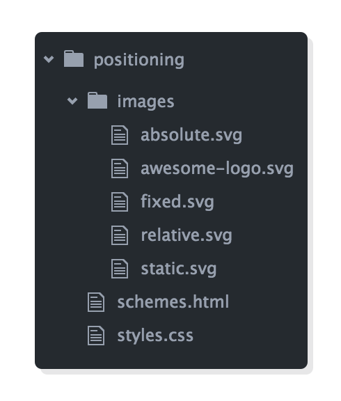
Start by creating a new Atom project called advanced-positioning and a new file called schemes.html with the following markup:
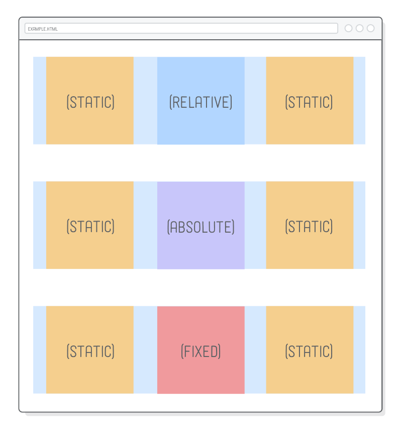
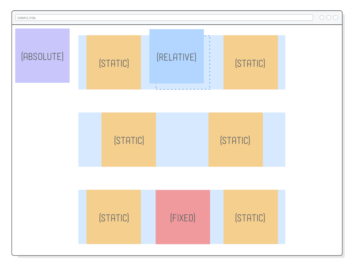
We’ve got three examples to work with, all with the exact same HTML structure. Changing the positioning behavior inside each one will have dramatically different effects.
This page relies on some images to make our example a little bit clearer. Keep the parent images folder when unzipping the files into your project, as show above. Be sure to create styles.css and populate it with the necessary base styles, as well:
Nothing new here, just some familiar flexbox techniques to create a grid of items. The only weird thing is the explicit height on the <body> element, which will let us scroll up and down the page to demonstration different positioning behaviors.
Positioned Elements
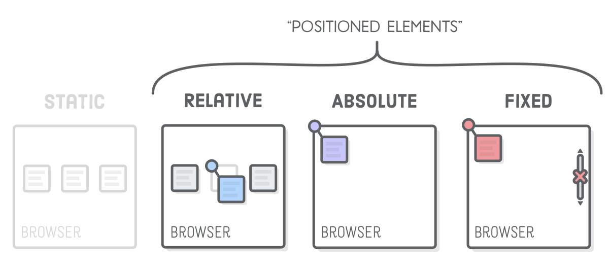
The CSS position property lets you alter the positioning scheme of a particular element. Its default value, as you might imagine, is static. When an element’s position property doesn’t have a value of static, it’s called a “positioned element”. Positioned elements are what this entire chapter is about.
It’s possible to mix-and-match different positioning schemes. Again, most of your web page should be statically positioned, but it’s common to find relatively and absolutely positioned elements inside of other elements that are part of the normal flow of the page.
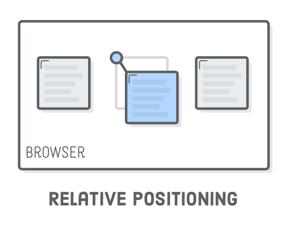
Relative Positioning
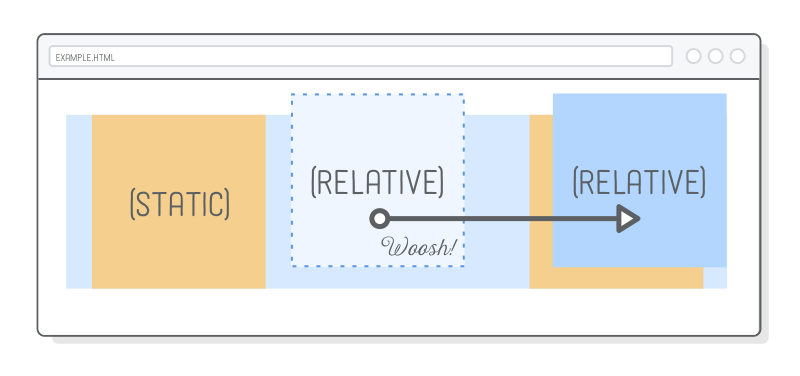
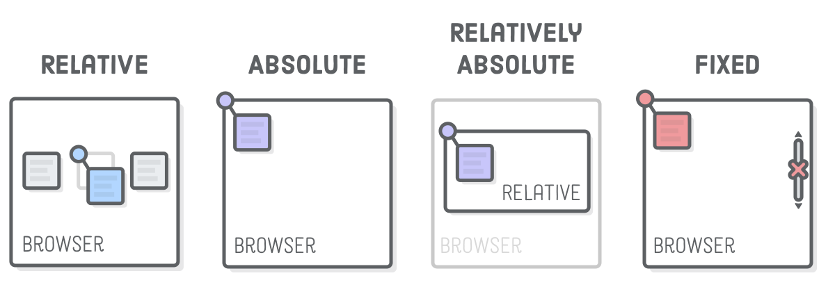
“Relative positioning” moves elements around relative to where they would normally appear in the static flow of the page. This is useful for nudging boxes around when the default flow is just a little bit off.
Let’s turn the .item-relative element in schemes.html into a relatively positioned element. Add the following rule to styles.css:
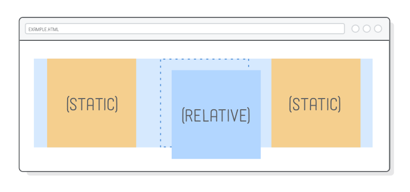
The position: relative; line makes it a positioned element, and the top and left properties let you define how far it’s offset from its static position. This is sort of like setting an (x, y) coordinate for the element.
Relative positioning works similarly to margins, with one very important difference: neither the surrounding elements or parent element are affected by the top and left values. Everything else renders as if .item-relative was in its original position. Think of the offsets as being applied after the browser finishes laying out the page.
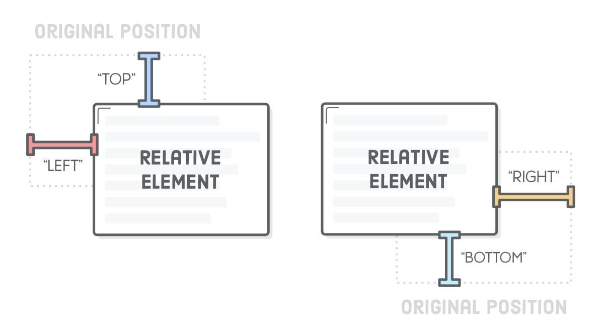
The top and left properties measure from the original box’s top and left edges, respectively. We can offset relative to the other edges with the bottom and right properties.
For example, the following will nudge the box in the opposite direction:
Note that these properties accept negative values, which means there’s two ways to specify the same offset. We could just as easily used top: -30px; in place of the bottom: 30px; declaration above.
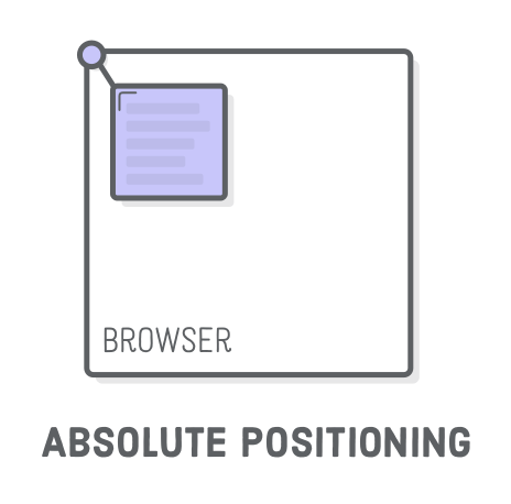
Absolute Positioning
“Absolute positioning” is just like relative positioning, but the offset is relative to the entire browser window instead of the original position of the element. Since there’s no longer any relationship with the static flow of the page, consider this the most manual way to lay out an element.
Let’s take a look by adding the following rule to our stylesheet:
Our HTML structure is the exact same as the previous example, but this will stick the purple image in the top-left corner of the browser window. You can also try setting a bottom or right value to get a clearer idea of what’s going on.
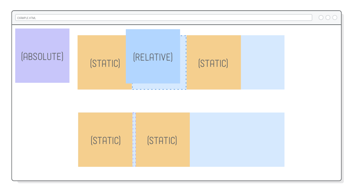
The other interesting effect of absolute is that it completely removes an element from the normal flow of the page. This is easier to see with left-aligned elements, so let’s temporarily change the justify-content property in our .example rule:
In our relative positioning example (the first row), there’s still a space where the positioned element used to be, but with absolute positioning, that space has vanished. It’s as if .item-absolute doesn’t even exist to its parent and surrounding elements. Be sure to change the justify-content back to space-around before moving on.
This behavior isn’t really all that useful most of the time because it would mean everything on your page needs to be absolutely positioned—otherwise we’d get unpredictable overlaps of static elements with absolute elements. So, why does absolute even exist?
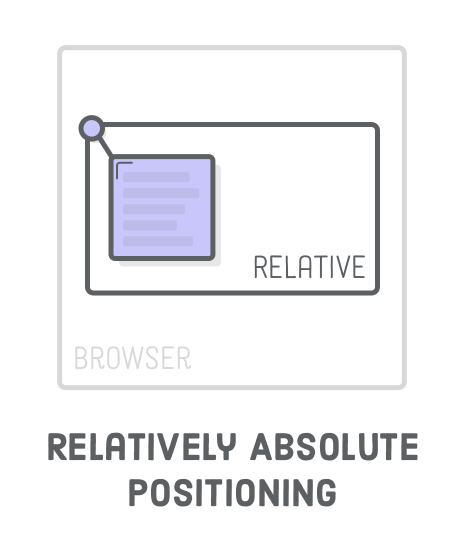
(Relatively) Absolute Positioning
Absolute positioning becomes much more practical when it’s relative to some other element that is in the static flow of the page. Fortunately, there’s a way to change the coordinate system of an absolutely positioned element.
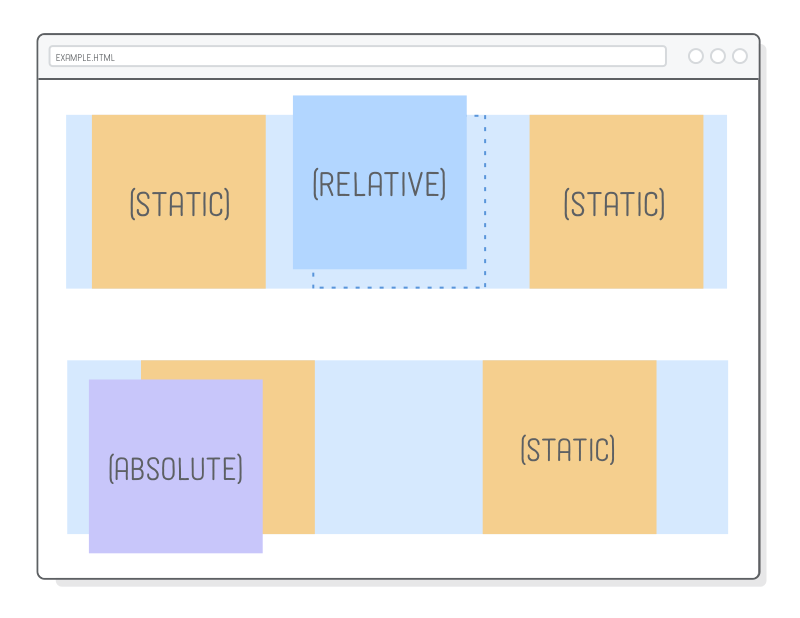
Coordinates for absolute elements are always relative to the closest container that is a positioned element. It only falls back to being relative to the browser when none of its ancestors are positioned. So, if we change .item-absolute’s parent element to be relatively positioned, it should appear in the top-left corner of that element instead of the browser window.
.absolute {
  position: relative;
}
The .absolute div is laid out with the normal flow of the page, and we can manually move around our .item-absolute wherever we need to. This is great, because if we want to alter the normal flow of the container, say, for a mobile layout, any absolutely positioned elements will automatically move with it.
Notice how we didn’t specify any offset coordinates for .absolute. We’re using relative positioning for the sole purpose of letting our absolute element hook back into the normal flow of the page. This is how we safely combine absolute positioning with static positioning.
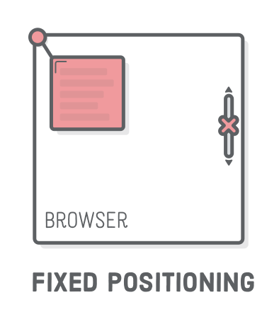
Fixed Positioning
“Fixed positioning” has a lot in common with absolute positioning: it’s very manual, the element is removed from the normal flow of the page, and the coordinate system is relative to the entire browser window. The key difference is that fixed elements don’t scroll with the rest of the page.
Go ahead and update our third example to use fixed positioning:
This will place the red image in the bottom-right corner of the screen. Try scrolling the page, and you’ll discover that it doesn’t move with the rest of the elements on the page, while the absolutely positioned purple image does.
This lets you create navigation bars that always stay on the screen, as well as those annoying pop-up banners that never go away.
Positioned Elements for Animation
This is a little out of scope, since this tutorial is about HTML and CSS, not JavaScript. However, animation is one of the primary use cases for relative and absolute positioning, so let’s take a little peek into the future by animating one of our elements.
These advanced positioning schemes allow JavaScript to move elements around while avoiding any kind of interaction with surrounding elements. For instance, try copying-and-pasting the following into schemes.html after the third .container element. The <script> element should be the last thing inside of <body>.
<script>var left = 0;
functionframe() {
var element = document.querySelector('.item-relative');
left += 2;
element.style.left = left + 'px';
if (left >= 300) {
clearInterval(id)
}
}
var id = setInterval(frame, 10)
</script>
This JavaScript code creates a simple animation that continually updates the left property of the .item-relative. When you reload the page, you should see the blue image float to the right edge of its container.
This is a pretty rudimentary example, but you can hopefully see how it’s applicable to fancy UI animations. If you were to try to achieve the same effect by manipulating the margin or padding properties, you would inadvertently move the statically positioned boxes and/or the containing .example element, too.
Positioned Elements for Menus
So, those are all the techniques. Let’s do something advanced with them! The rest of this chapter applies our newfound skills towards a fancy navigation menu with an interactive dropdown for one of its links. We’ll be building this page entirely from scratch.
Fixed positioning will let us make the menu stick to the top of the page, and relative positioning will give us an anchor for the absolutely positioned dropdown. We’ll also get a chance to talk about navigation menu best practices and see some practical applications of the pseudo-classes we talked about in CSS Selectors.
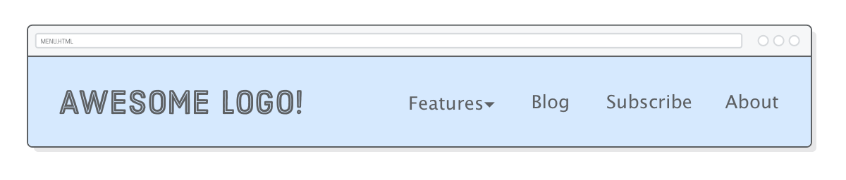
For starters, we need a new web page called menu.html that has a header and a simple top-level menu:
Navigation menus should almost always be marked up as a <ul> list instead of a bunch of <div> elements. These semantics make your site’s navigation much more accessible to search engines. Also notice how we’re preparing for our dropdown menu by adding a class attribute to the first <li> in the list. That <span> will allow us to differentiate the label from the submenu it reveals.
Next, we need a new stylesheet called menu.css that makes our .header look a little bit more like a header, among other things:
This should all be familiar, but note the fixed position of the .header, which keeps our navigation menu on top of any content that would go into the page.
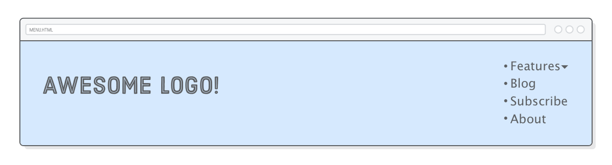
Inline Menu Items
Despite being marked up as unordered lists, the navigation menus for most websites don’t actually look like a list. We can fix this by making the list items inline boxes instead of block boxes via the display property. Add the following to menu.css:
We have to use child selectors here instead of descendant selectors because we only want to select <li> elements that are directly inside the .menu. This will become important once we add our submenu, which has its own <li> elements that we don’t want to style with this rule. This snippet also adds margins to all the list items, but removes it from the final <li> using the :last-of-type pseudo-class. This is a pretty common technique for creating margins between items.
Submenus
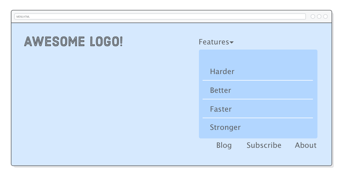
Our submenu is going to look just like the top-level menu, except the whole thing will be nested inside a list item. Change the .menu element to match the following, ensuring that the entire .features-menu list is wrapped in the first <li> of the .menu element.
<ulclass='menu'><liclass='dropdown'><span>Features ▾</span><ulclass='features-menu'><!-- Start of submenu --><li><ahref='#'>Harder</a></li><li><ahref='#'>Better</a></li><li><ahref='#'>Faster</a></li><li><ahref='#'>Stronger</a></li></ul><!-- End of submenu --></li><li><ahref='#'>Blog</a></li><!-- These are the same --><li><ahref='#'>Subscribe</a></li><li><ahref='#'>About</a></li></ul>
This provides a lot of crucial information for search engines. It allows Google to see that all these new items are associated with the Features label and that they form an isolated section of our website. You should always mark up complex navigation menus with this kind of structure.
As for the CSS, we’ll deal with the interactive dropdown part later. Right now, let’s just get our submenu looking the way we want it to. Add some simple styles so we can see the box we’re trying to position:
The submenu itself is styled correctly, but it’s showing up in the wrong place and severely messing up the rest of our top-level menu items. This should be expected because it’s still statically positioned, which means it still interacts with its parent and surrounding elements.
To create our desired layout, we need to call on our new CSS positioning skills.
(Relatively) Absolute Submenus
We want our other top-level menu items to display just like they did before we added the submenu, as if the submenu wasn’t even there. Wait a second…that’s the exact behavior of absolutely positioned elements. Let’s give it a shot. Add a few lines to the .features-menu rule:
Great! The submenu is no longer part of the static flow of the page, so our top-level menu items are back to normal. However, the submenu should appear underneath the Features label—not in the corner of the browser window. What a coincidence…we just learned how do that!
The submenu resides in <li class='dropdown'>. Turning that into a positioned element should change the coordinate system used by our absolutely positioned .features-menu:
.dropdown {
  position: relative;
}
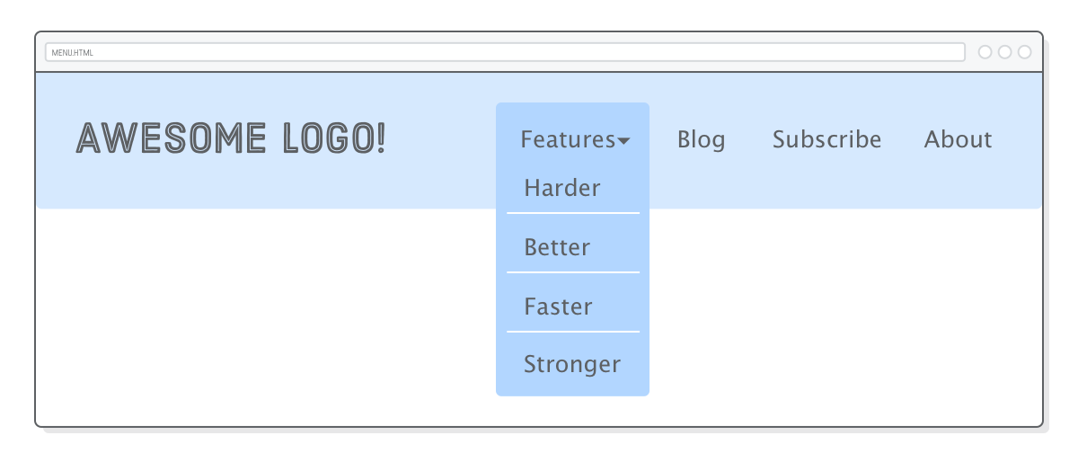
Ok, next problem. Our submenu is in the right spot, but now it’s covering up the Features label.
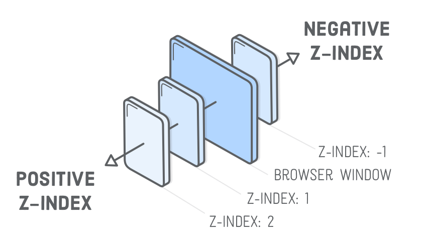
Z-Index
We’ve never had to deal with “depth” issues before. Until now, all our HTML elements rendered above or below one another in an intuitive way. But, since we’re doing advanced stuff, relying on the browser to determine which elements appear on top of other ones isn’t going to cut it.
The z-index property lets you control the depth of elements on the page. If you think of your screen as 3D space, negative z-index values go farther into the page, and positive ones come out of the page.
In other words, the .features-menu element needs to have a lower z-index than the Features label. The default z-index value is 0, so let’s make both of them higher than that. We conveniently wrapped the Features label in a <span>, allowing us to style it via a child selector, like so:
The Features label should now appear on top of the submenu. Take note of that position: relative; line. It’s required because only positioned elements pay attention to their z-index property. This is easy to forget, so make a mental note for the next time you’re having depth issues and your CSS rules don’t seem to have any effect.
We threw in an example of the cursor property to make it look like a link when the user hovers over the label. You can read more about it at Mozilla Developer Network.
Pseudo-Classes for Dropdown Menus
Alright! Submenu done! Our final task is to hide it until the user hovers over it. Remember that :hover pseudo-class from the CSS Selectors chapter? We can use that to turn our submenu into an interactive dropdown.
First, we need to change our existing .features-menu rule to only show the submenu when the user hovers over it by adding a :hover descendant selector. Update the .features-menu selector to match the following:
.dropdown:hover.features-menu { /* This used to be `.features-menu` */display: flex; /* Leave everything else alone */flex-direction: column;
background: #B2D6FF;
/* ... */
}
Then, we need to initially hide the submenu using the display property. Add a new rule to menu.css:
.features-menu { /* Add this as a new rule */display: none;
}
Setting display to none makes an element completely disappear. By overriding that value with flex in the :hover rule, we’re effectively telling the browser to show the .features-menu again. This clever combination of descendant selectors and pseudo-classes enables us to conditionally hide or show an element.
Summary
In this chapter, we took a look at four new CSS layout schemes:
Relative
Absolute
Relatively absolute
Fixed
Relative positioning was for tweaking the position of an element without affecting its surrounding boxes. Absolute positioning took elements out of the static flow of the page and placed them relative to the browser window, while relatively absolute positioning allowed us to hook back into the static flow of the page. Finally, fixed positioning let us make elements that didn't scroll with the rest of the page.
We used these new positioning techniques to create a rather sophisticated navigation menu. If it felt complicated, that’s cause it was. But don’t worry, you shouldn’t feel pressure to memorize the HTML and CSS behind our menu. Your goal should be to have the ability to reference this example three months from now and understand what all those position: relative; and position: absolute; declarations are doing.
This menu was also a pretty good example of how starting with the HTML markup makes life a lot easier. First, we created the semantic structure we wanted. Then, we wrote some fancy CSS to position the boxes right where we wanted them. Whenever you’re looking at a complicated mockup and not sure where to start, this is good way to approach the problem.
There’s still one big issue with our menu: it’s not built for mobile devices. Smartphones and tablets don’t have a way to hover, and our layout doesn’t display well when the browser is narrower than 960 pixels. The former requires a little bit of JavaScript magic (or some really advanced CSS), so we’ll leave that for another tutorial. But, we will be able to tackle the latter problem with some responsive design in the next chapter.